Cleaning up the branding and polishing of the logo.
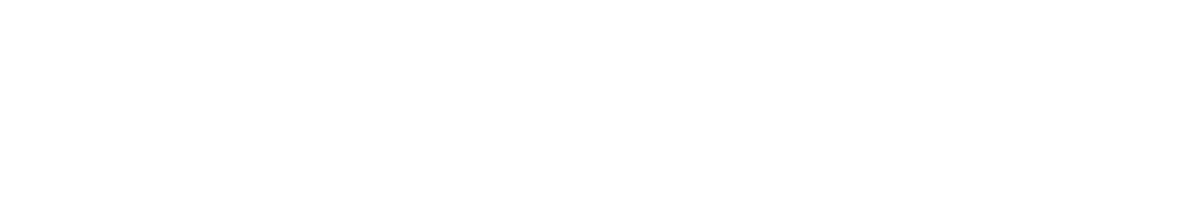
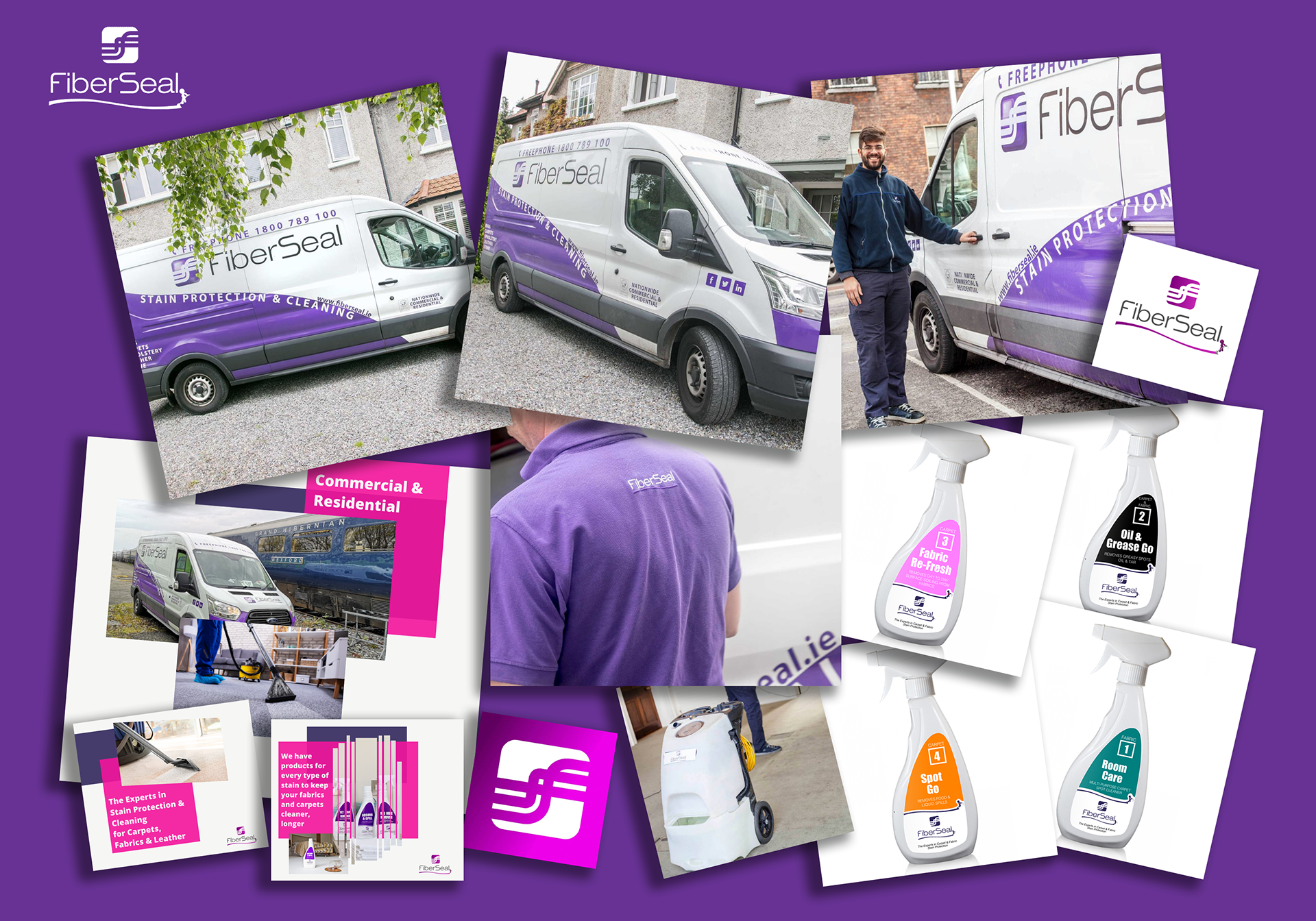
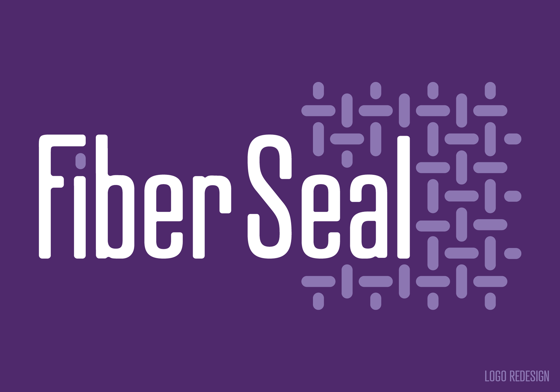
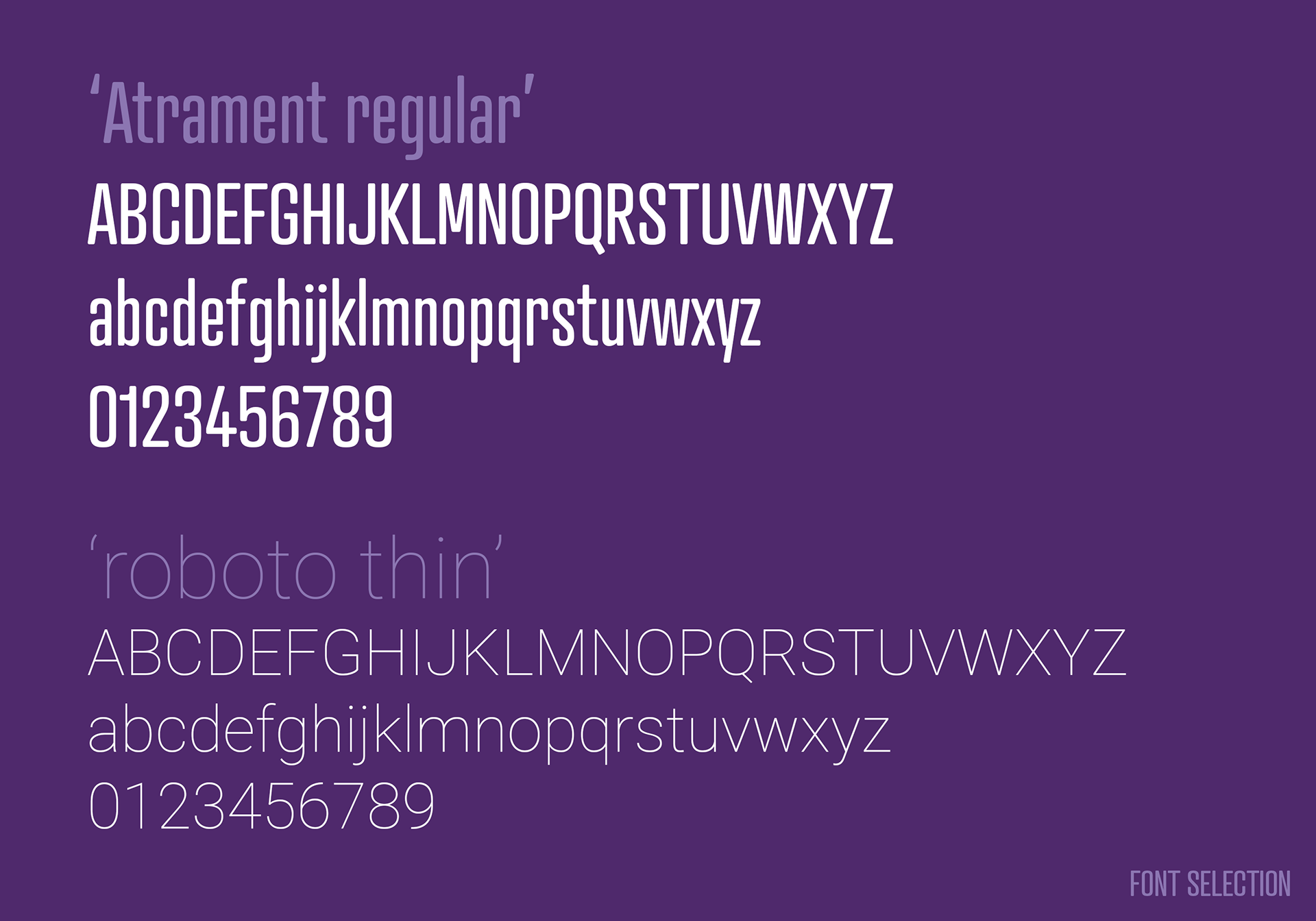
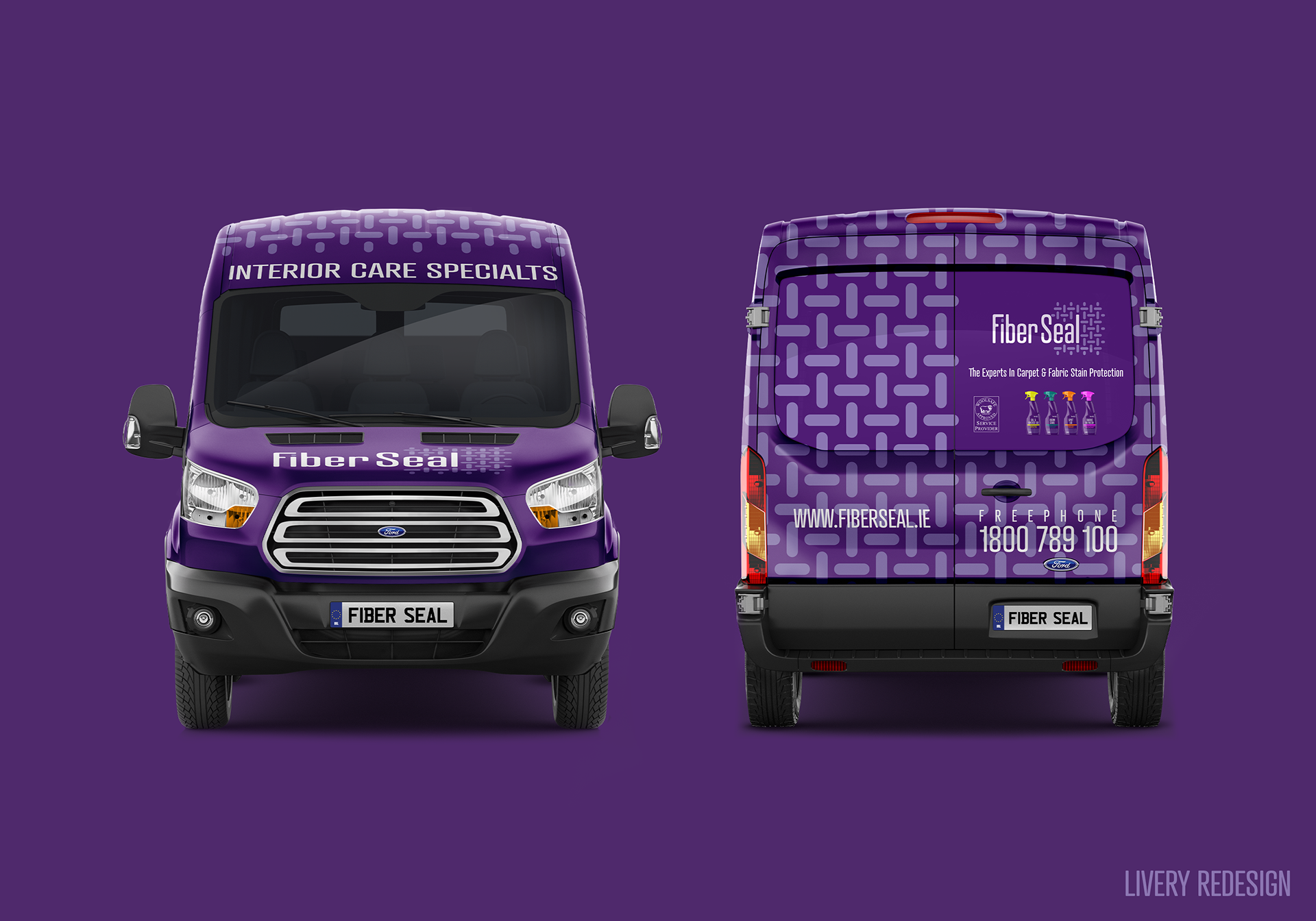
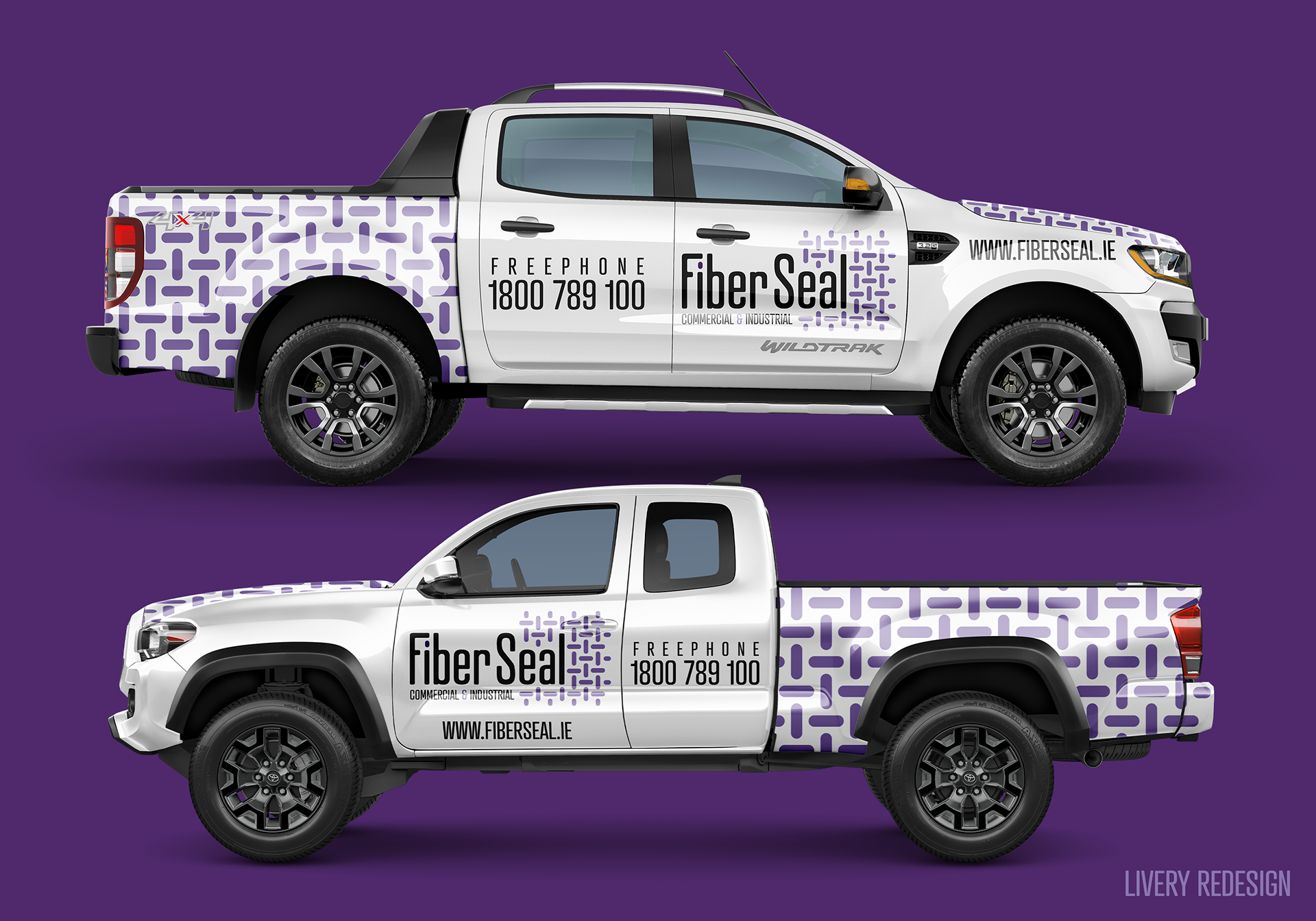
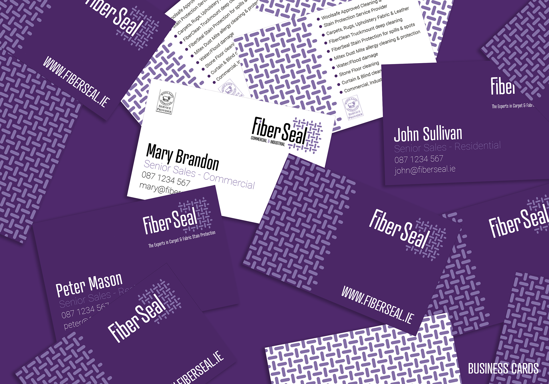
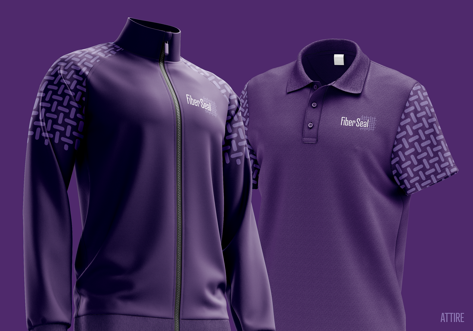
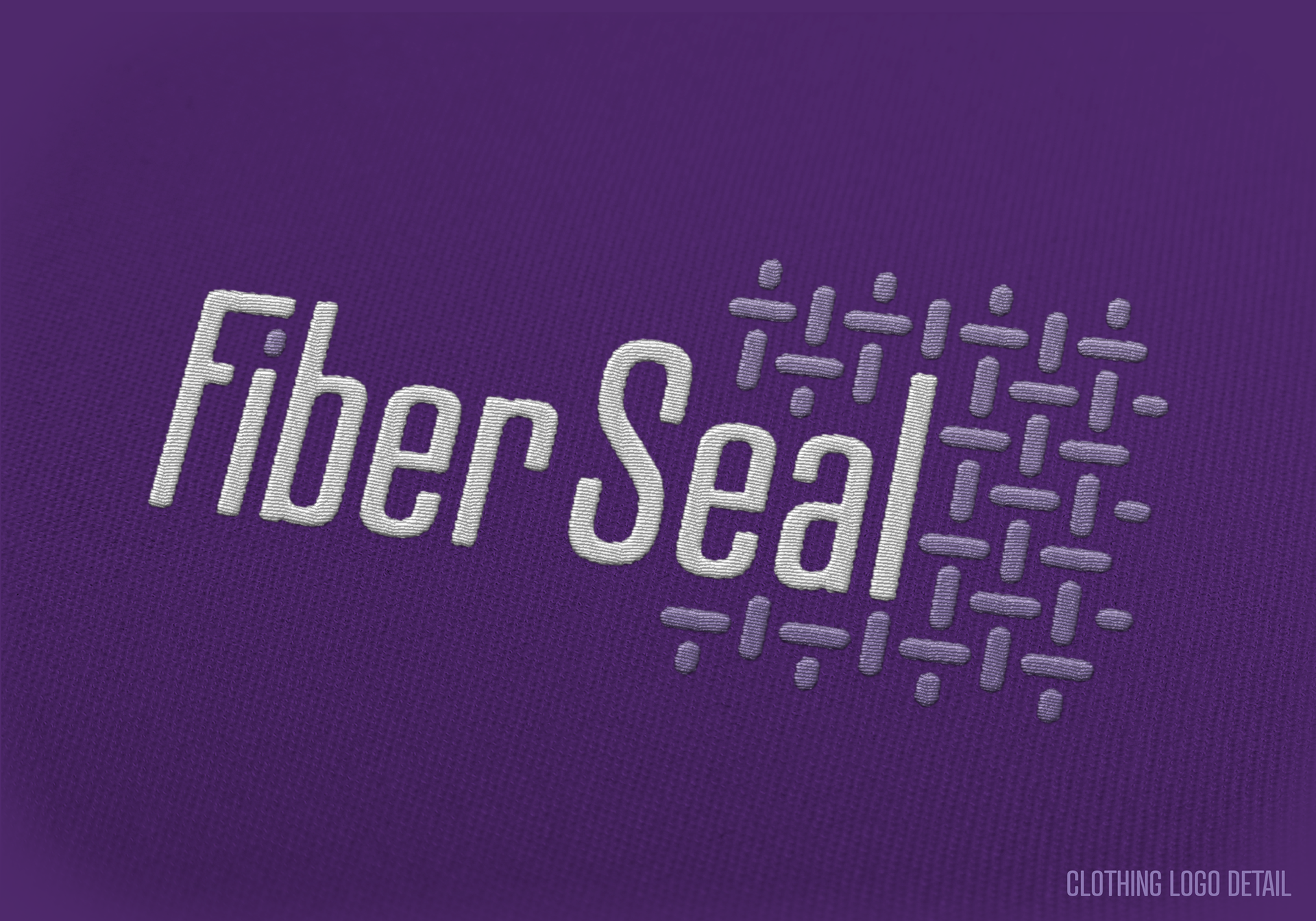
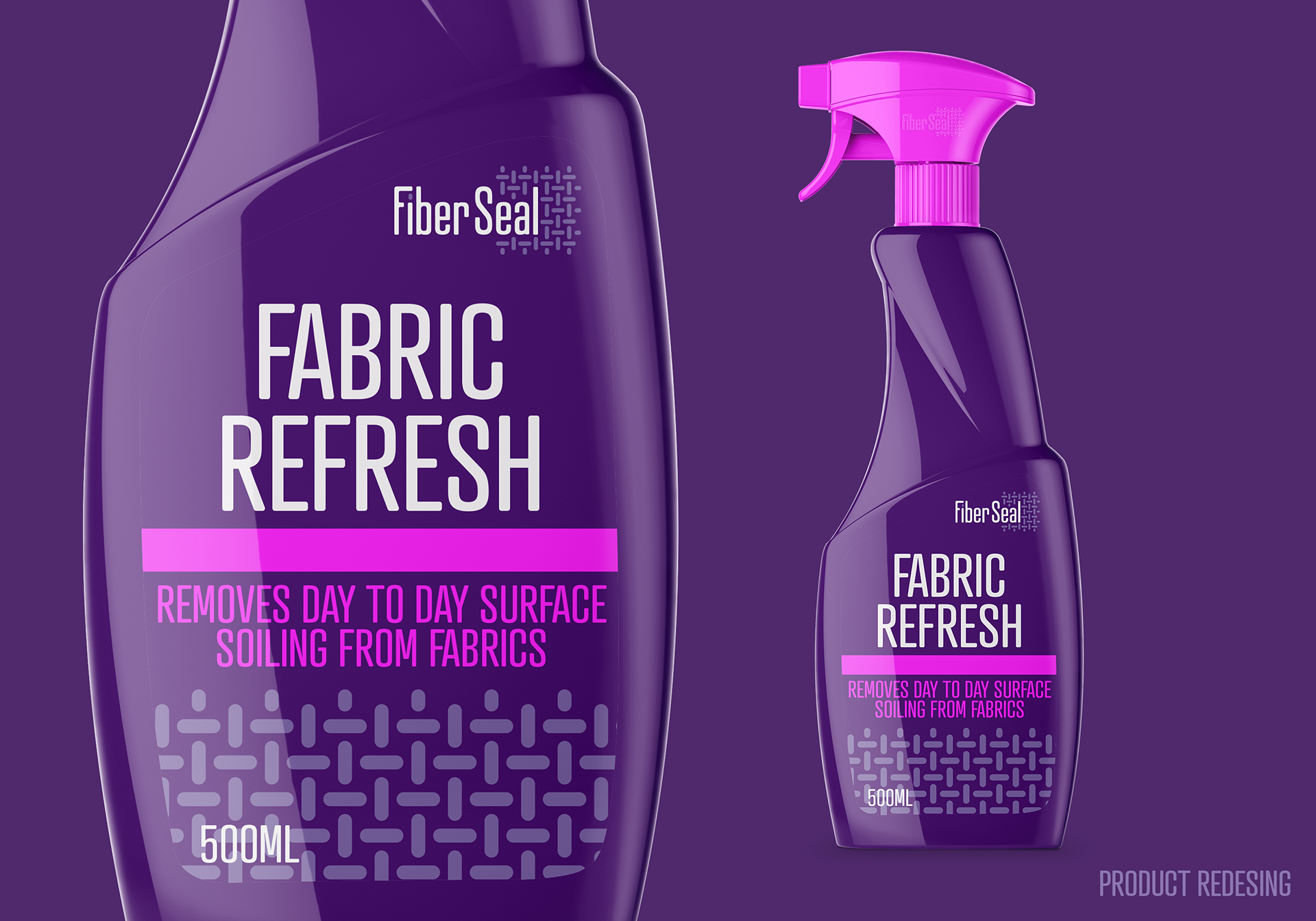
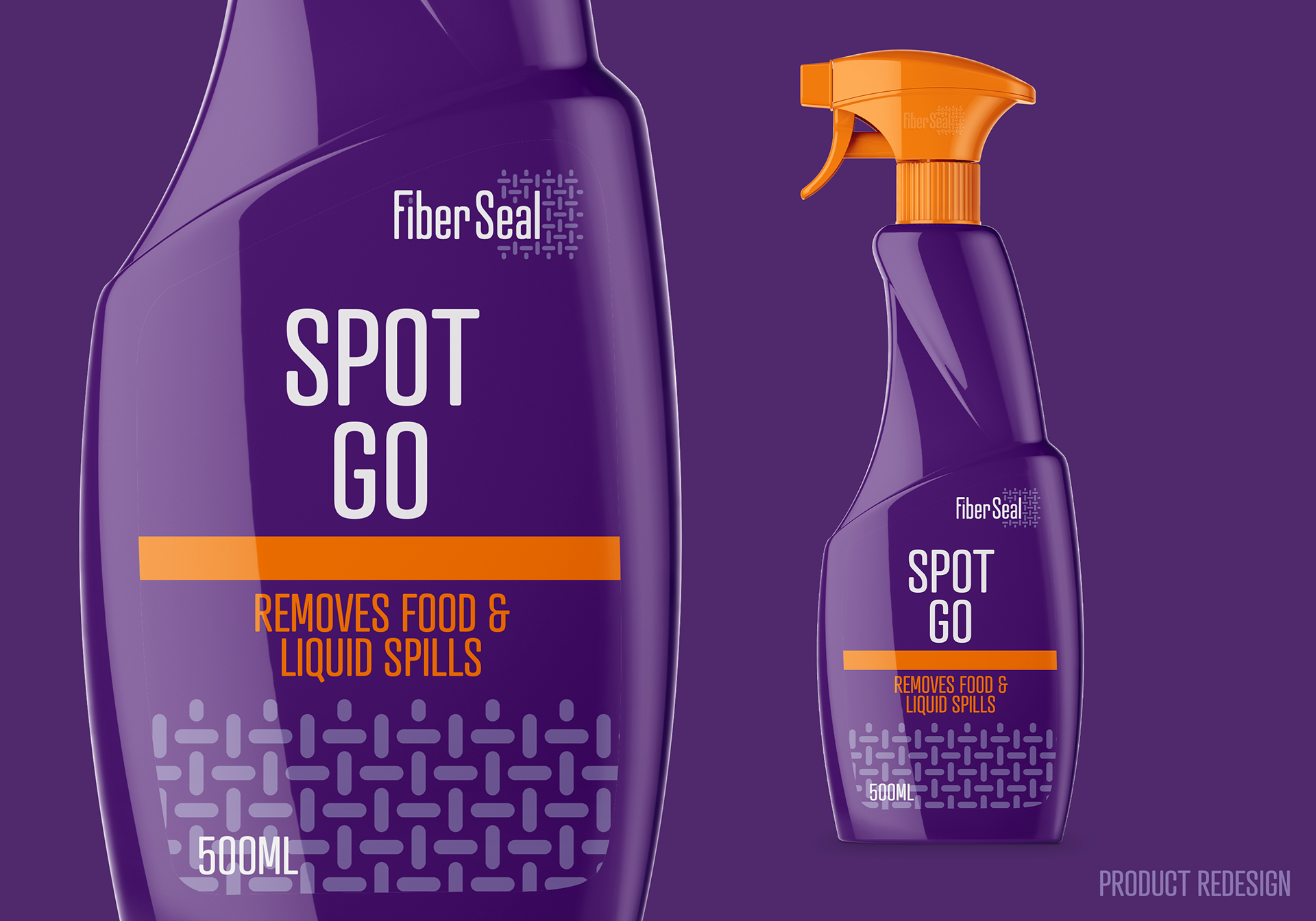
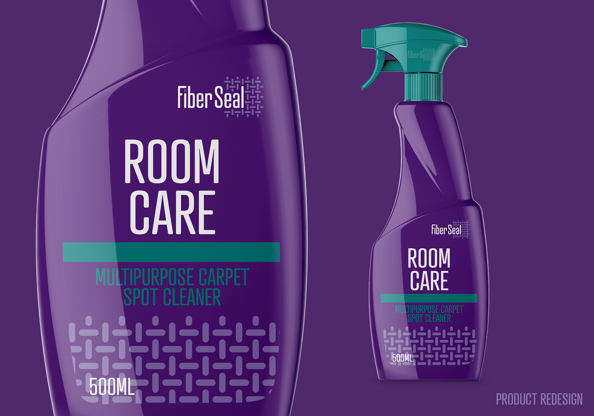
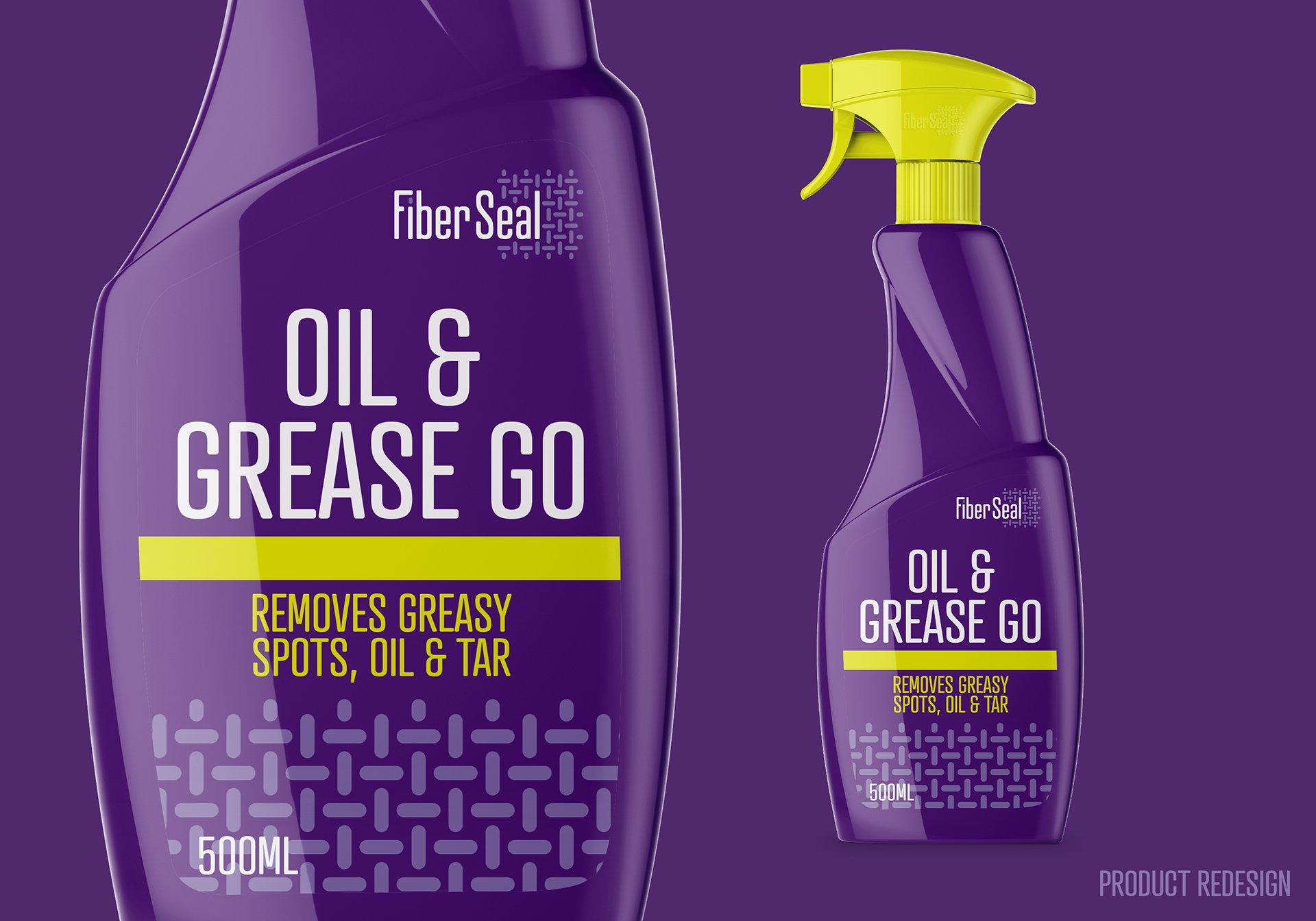
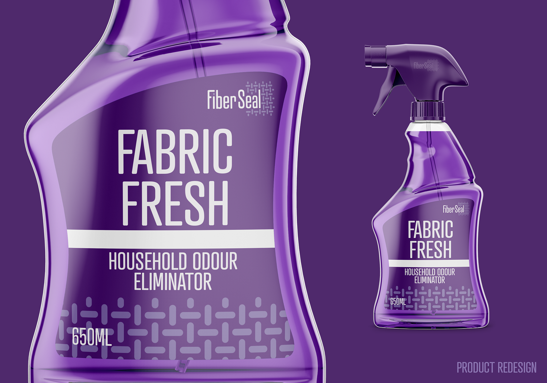
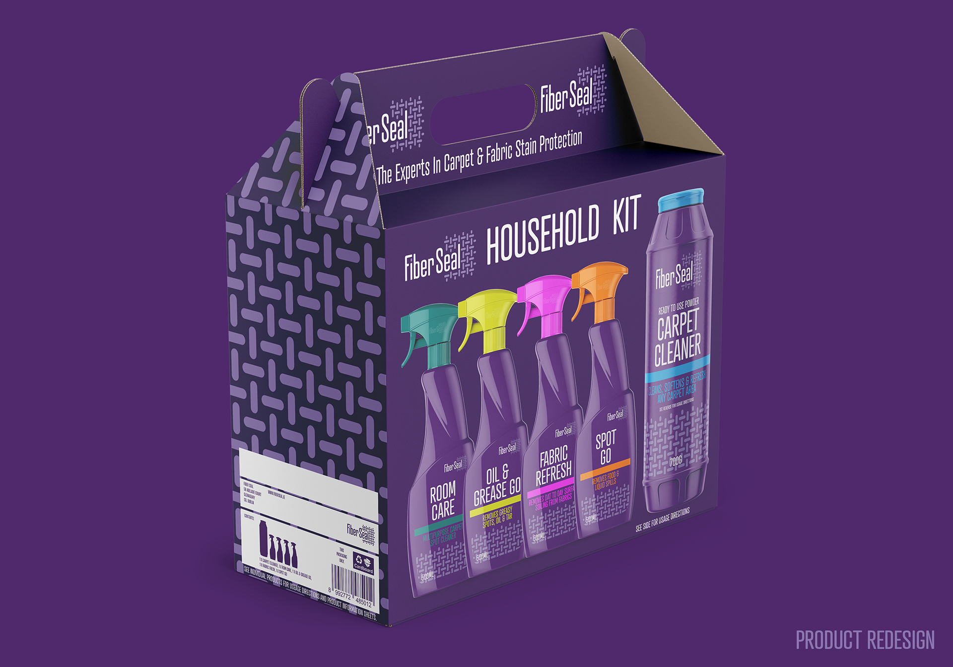
To stand out in a competitive marketplace and to position itself as a higher value product and service, a distinctive brand colour was chosen along with the redesign of the existing logo/wordmark and an update to the packaging of the retail products that were stocked. A simplified icon replaced the more complex current one, used, with the advantages of being scalable and applicable as a pattern. The logo/wordmark reflects elements of the pattern and vice versa, to keep the identity across the various elements unified. A simplified livery was also adapted with the addition of certain elements (such as the wordmark/pattern) that, in low light scenarios, these 'reflective' elements make the brand stand out more effectively. Additionally, a commercial/industrial version of the wordmark and icon was created to have a 'co-brand' with the residential and commercial aspects of the company. The retail products have also been redesigned to reflect the new market appeal and to move away from the ‘own-brand/yellow pack’ look of the current products, accompanied POS materials and products.
*This was evaluated as a viable design to be used going forward, however, these designs were not used in their current form.
LINKS: FiberSeal


© COPYRIGHT WWW.ROBLOUGHLIN.IE 2024