Masthead and magazine redesign.
Similar to the Astronomy Ireland redesign, this magazine was found on the Readly app and is also a printed publication released in the UK and Ireland. It is a publication aimed at the haulage industry both as a B2B and as a B2C connection. The redesign of the masthead/logo along with some type treatments and layout elements for the rest of the publication aims to bring it to a more modern style, with less clutter and more formatting of the layout. This will also lend itself to the publication to be read more easily as a digital product, or as a different digital format with the addition and redesign of the new elements.
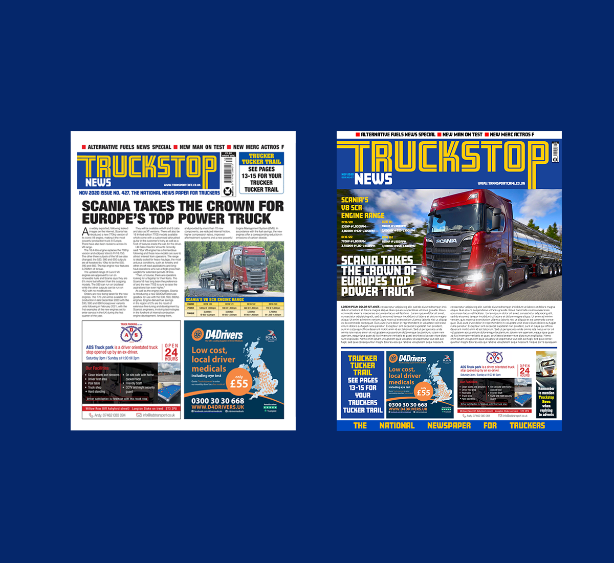
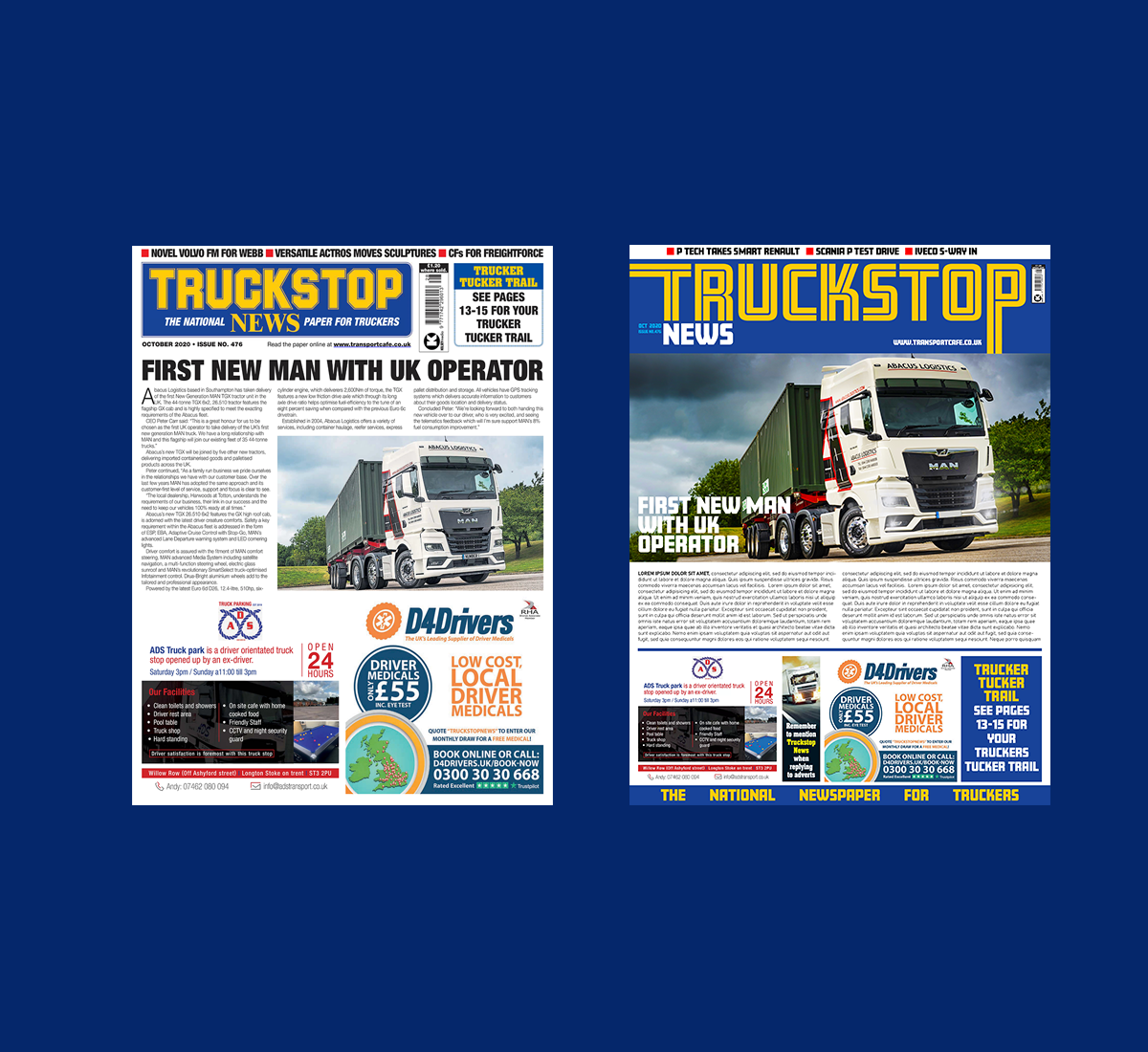
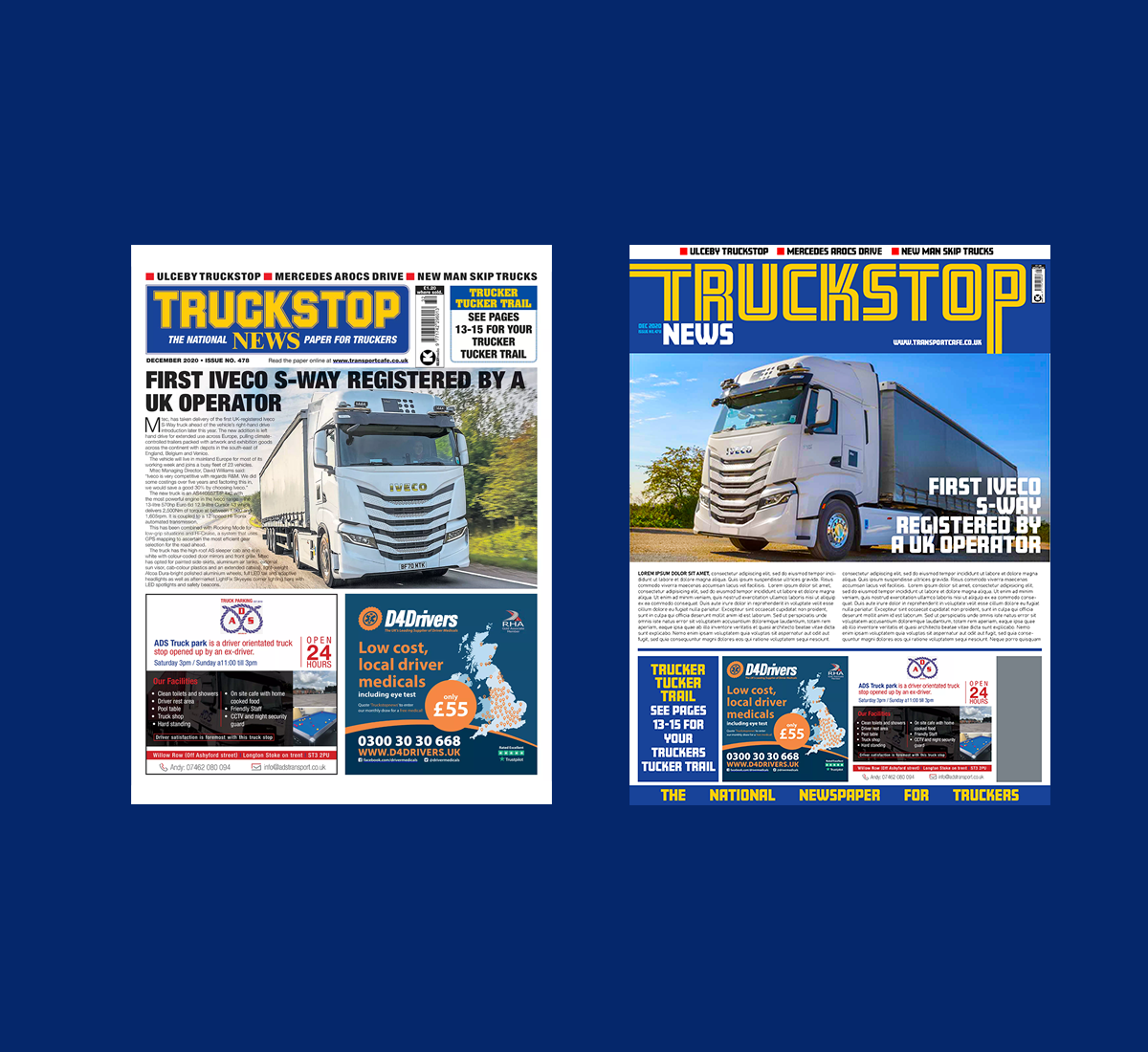
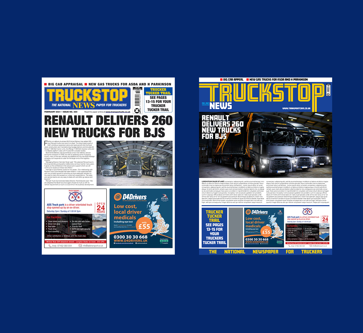
▲ The current look of Truckstop News has a strong newspaper feel, probably originating from its early publication roots. Whilst this distinguishes it from other titles in the marketplace, it also somewhat dates it look, and in comparison to other similar publications, it doesn't have the 'shelf-impact' other covers have. This is reflected in both digital copies, shown in the Readly App, and in print form as can be seen above.
▲ The masthead has been updated for a better visual impact and removed some of the 'clutter' that surrounds the current masthead. This new design is more refined and better viewed in digital form. It also make the Truckstop News a more proprietary mark that can enhance the brand presence.
▲ The masthead has now more space surrounding it for a cleaner appearance but still retaining the familiar, original colours. Additional elements such as date, and web address are used on the monthly publications.The first and last letters have a full bleed effect over the bounding box when used on the publication when used with the holding masthead shape.
▲ Comparison can be seen between the current (top) and the redesigned masthead (bottom). A new typeface has also been introduced for headlines and by-lines, both on the cover and inside. The masthead is from the same type face, but this particular font has been altered to accommodate its use in the logotype.


▲ Changes to the cover, both print and digital include changes to the layout and positoning of the hero image, typeface changes, and alignment and spacing with additional elements.
▲ On the digital reader platforms, the thumbnails have also changed. Shown here in the Readly App, the thumbnail takes the same appearance as the actual cover. This 'cover template' adds consistency to the appeanrce and adds a greater visual impact to the images used in the cover articles. It also reflects the marketplace that the publication can be found it.
▲ To continue the update of the publication, the inside layout has also been updated slightly. The main elements and layout remain similar, but changes have been made to the headline fonts and body copy. Some changes have also been made to the header and footer areas.
▲ The new logotype, headlines and by-lines are based on the Amboy typeface. The logotype uses the Amboy Inline font with some edits, and both the headlines and by-lines use the Amboy Black font. The bodycopy has also been updated to the Bahnschrift typeface.
© COPYRIGHT WWW.ROBLOUGHLIN.IE 2022

