
Logo redesign and branding layout
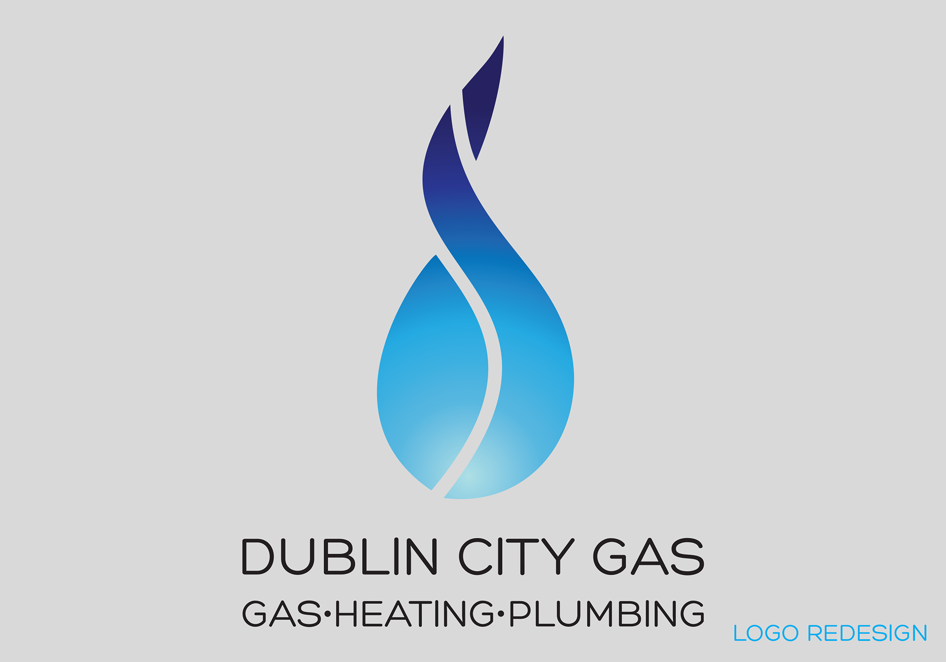
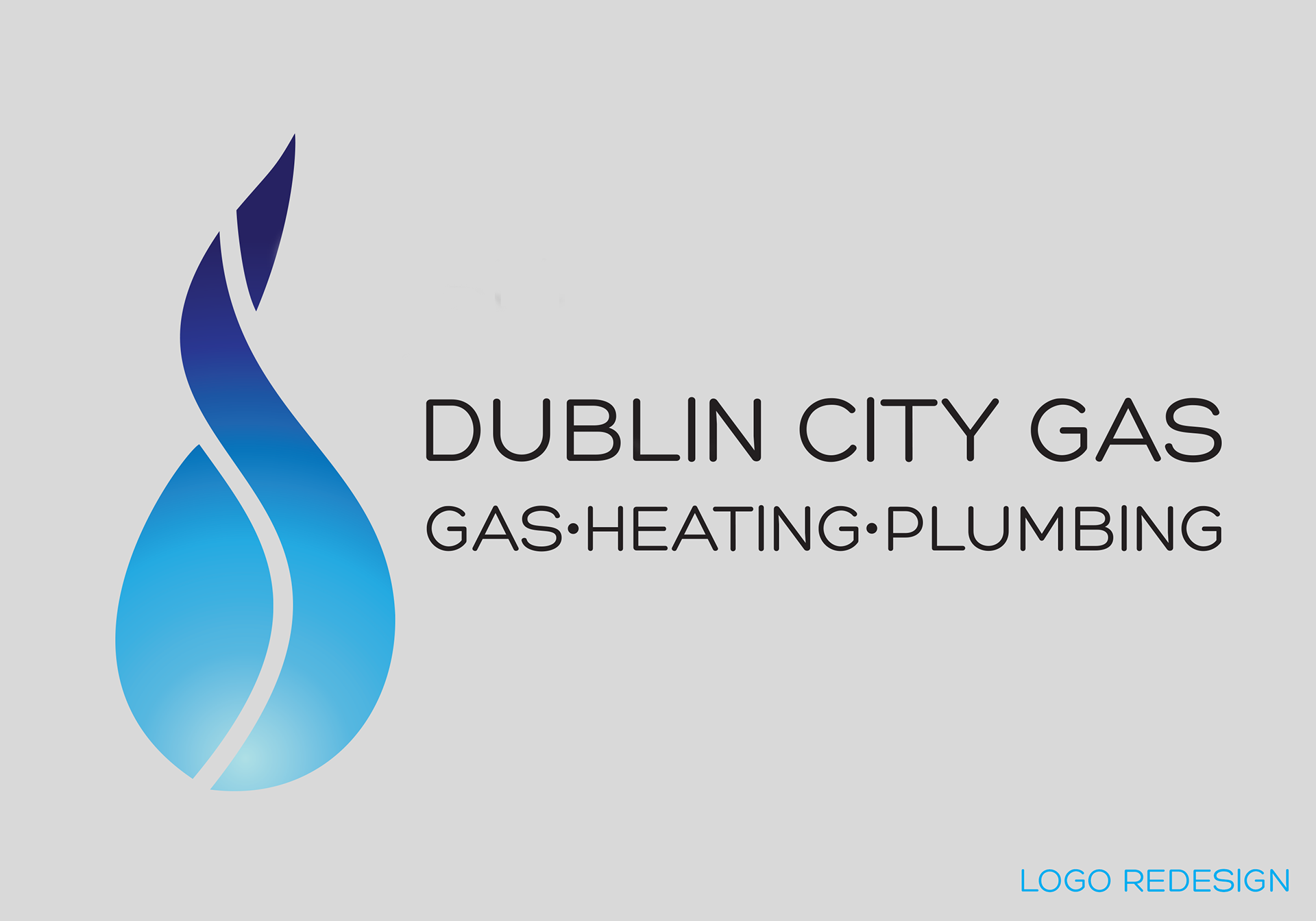
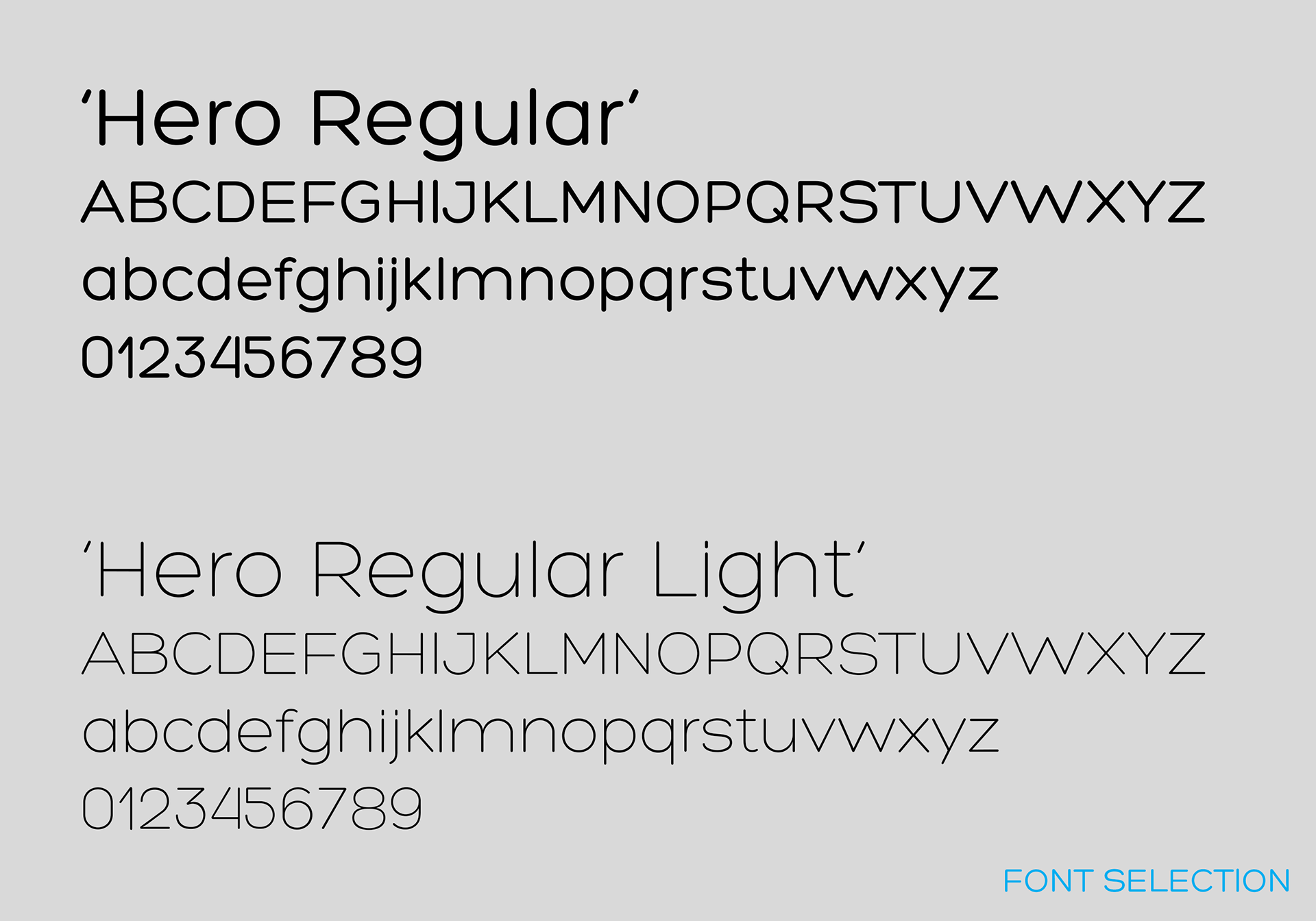
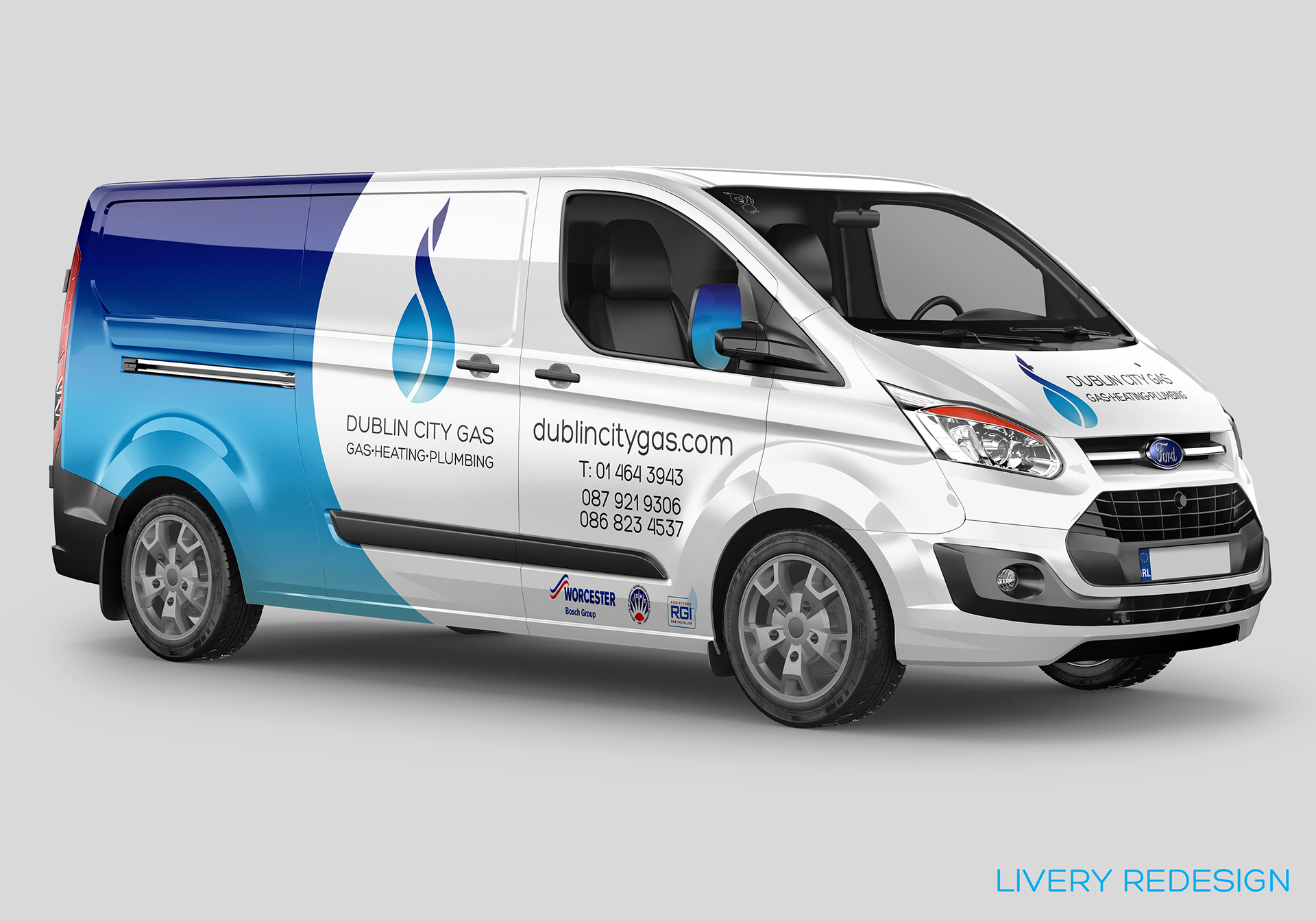
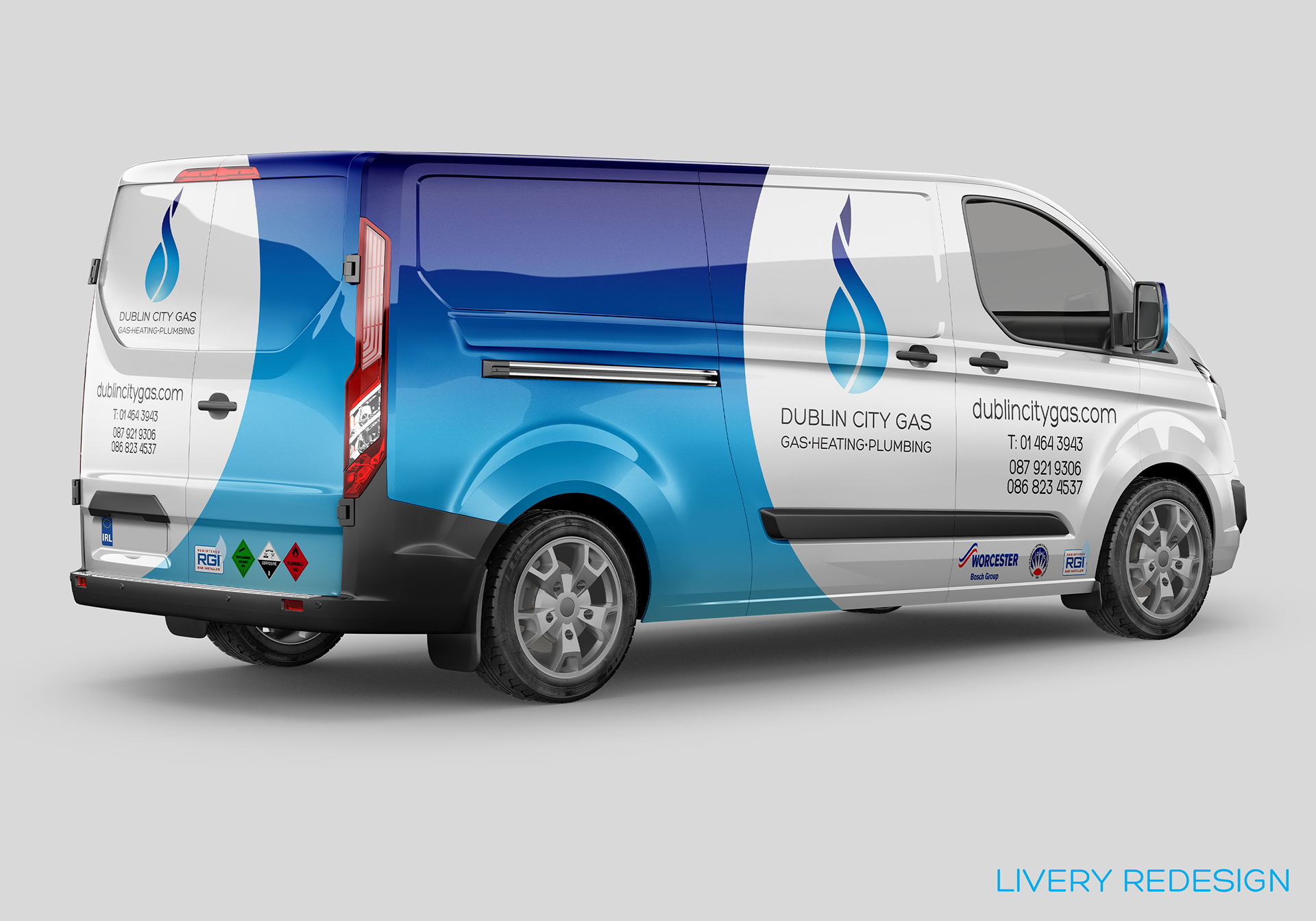
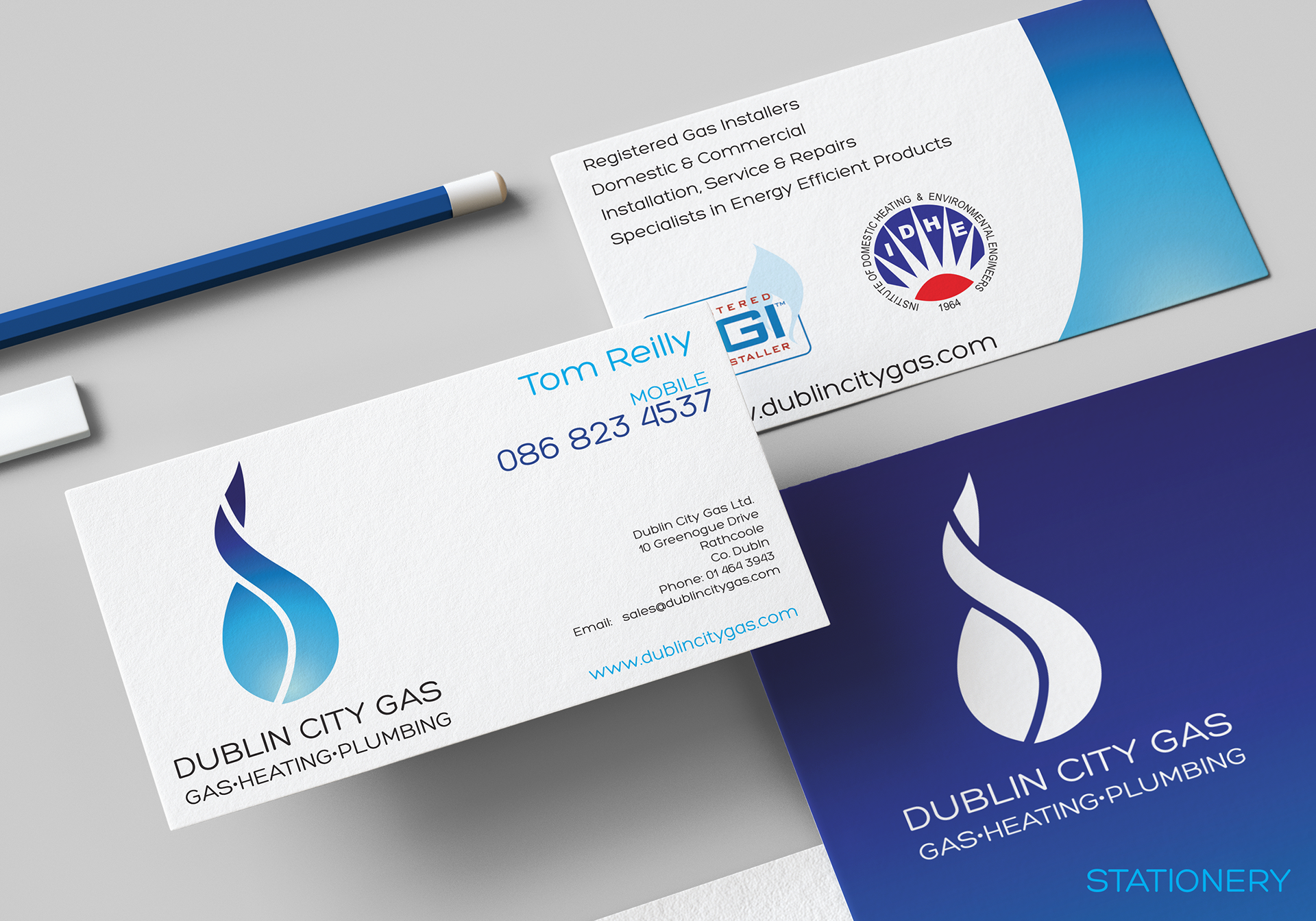
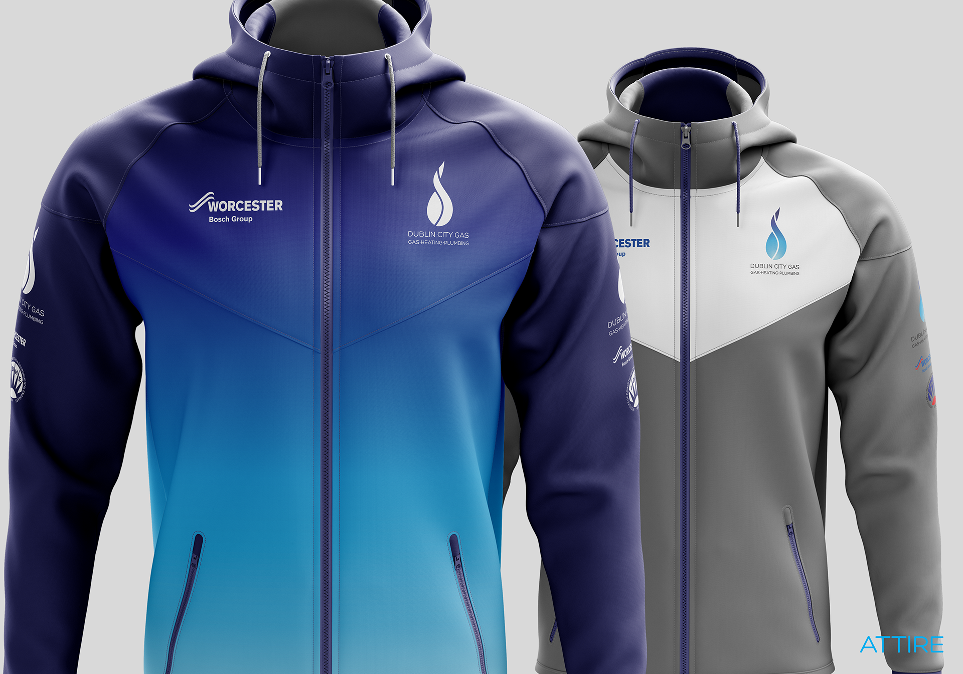
In revamping the overall appearance of Dublin City Gas (DCG) and the new logo was developed along with new brand colours with associated elements. These would be used across the various touchpoints that DCG operates in both, commercial, industrial, residential and retail product aspects. The new logo represents the 'd' referencing the Dublin in DCG, along with a water droplet/flame representing the services that DCG undertake. A colour palette was chosen, based on the previous use of blue, but with some slight changes to the shades, along with a new addition of two gradient elements. A new typeface was also selected to bring a simpler approach to the various text elements. A big part of the redesign and one of the first starting points was the livery of the various vehicles as this was a very important part to the client. A minimal approach was taken with the livery to avoid any 'busyness' and taking a strong colour blocking of the gradient palette against a white backdrop gave a strong visual identity, as well as a recognisable, replicable element that can be used on various touchpoints.
-WIP-
LINKS: dublincitygas


© COPYRIGHT WWW.ROBLOUGHLIN.IE 2021