A quick WIP of a redesign/reimagining of the monthly Astronomy Ireland (AI) magazine and redesign of the masthead/logo.
Having a keen interest in space and all things related, I had noticed that one of the leading astronomy bodies in Ireland was still producing a respected monthly print magazine (who said print is dead!) for the last number of decades. While the magazine is very insightful and full of interesting articles and facts, I thought that some of the designs and layouts that were being used could be updated to reflect what the other publications and bodies are doing in this space...pardon the pun. The redesign that I've come up with, whilst still a WIP, I think brings the branding of AI up to date and has more impact on the users and potential users. The redesign also has scope to be used more effectively in the digital space and to position the AI brand in a very competitive marketplace and can be expanded to be both the digital areas and also the brand expansion and merchandise possibilities.
LINKS: Astronomy Ireland Astronomy
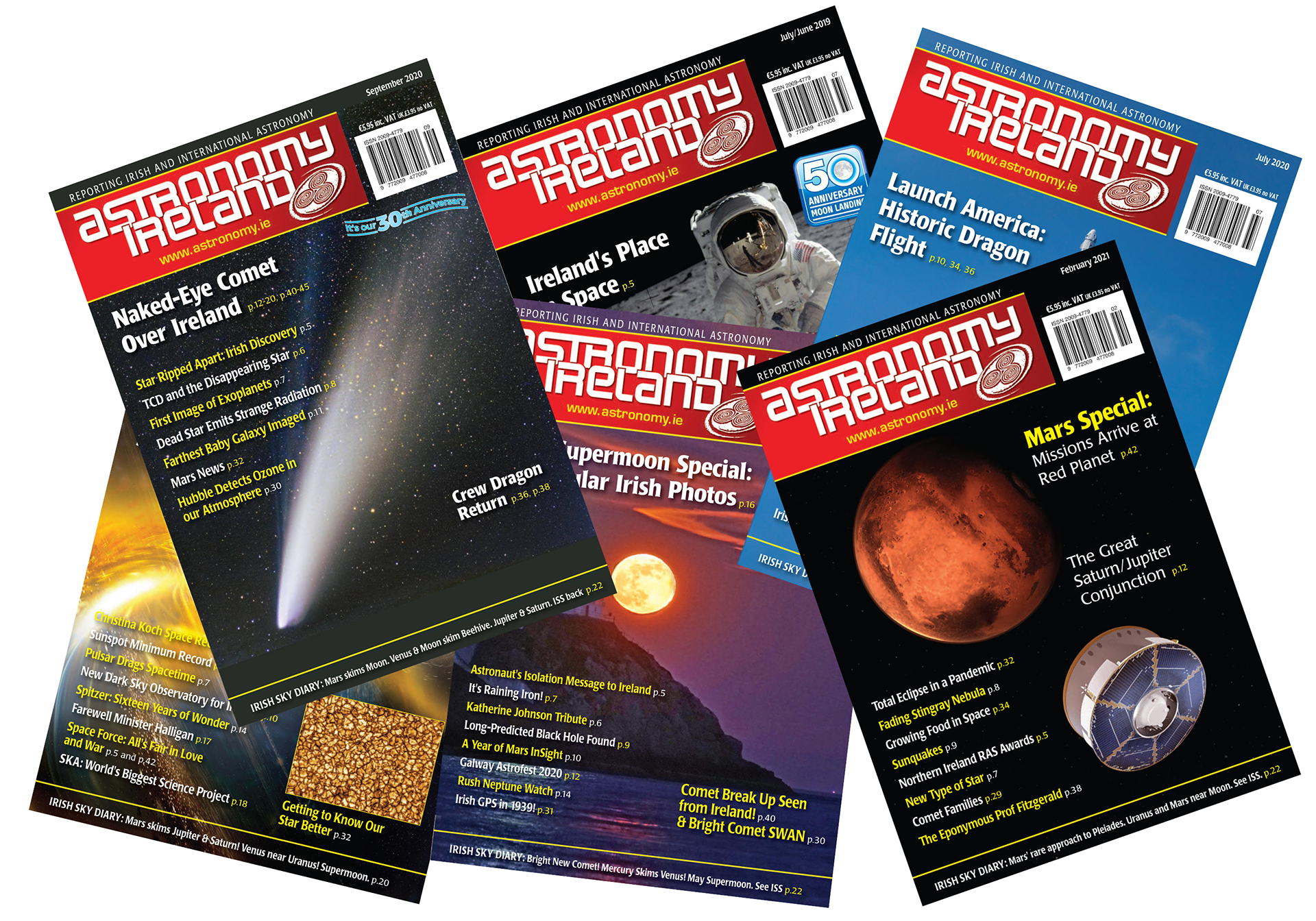
▲ A selection of issues of the AI magazine covers showing the current masthead, logo, and type treatment used since 2012.
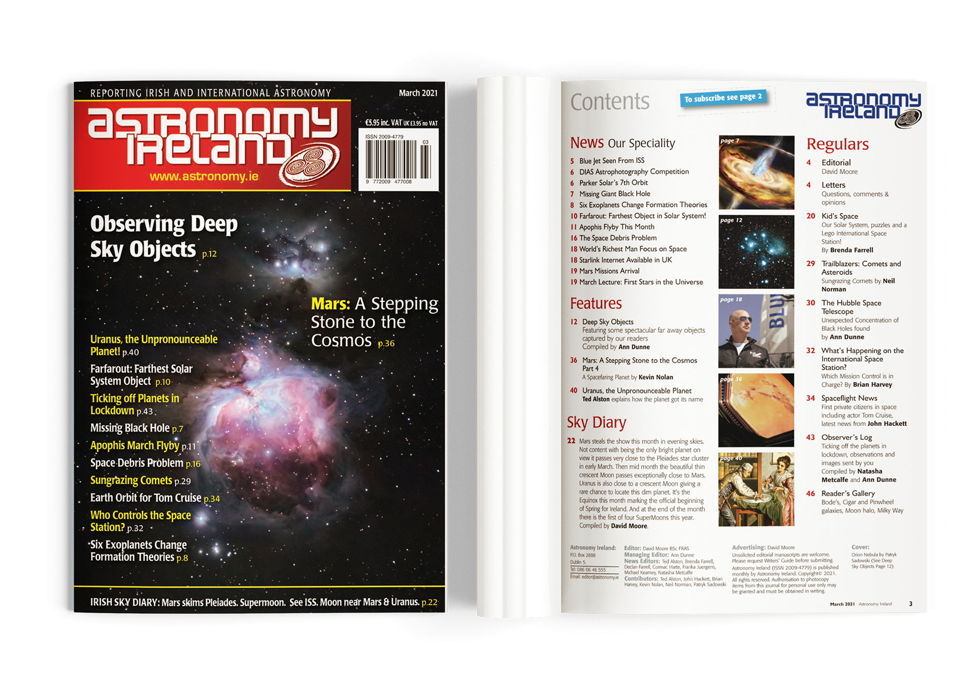
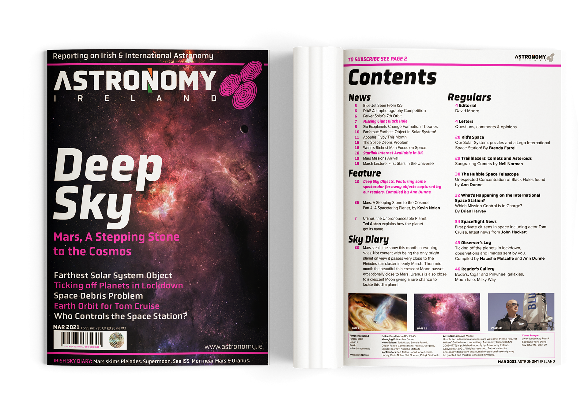
▲ The cover and contents page of the March 2021 issue shows the layout and typography elements used.
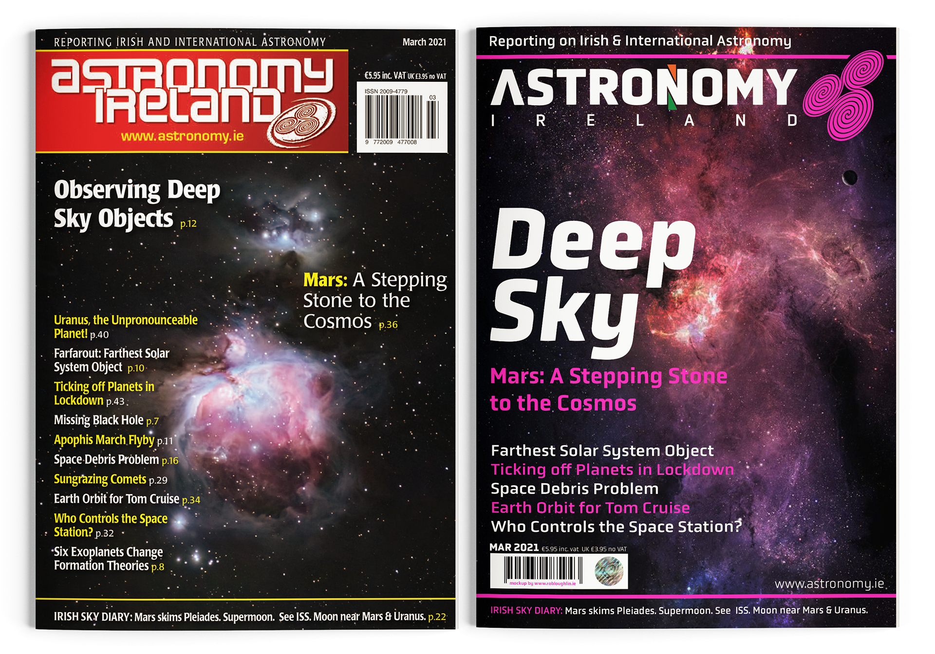
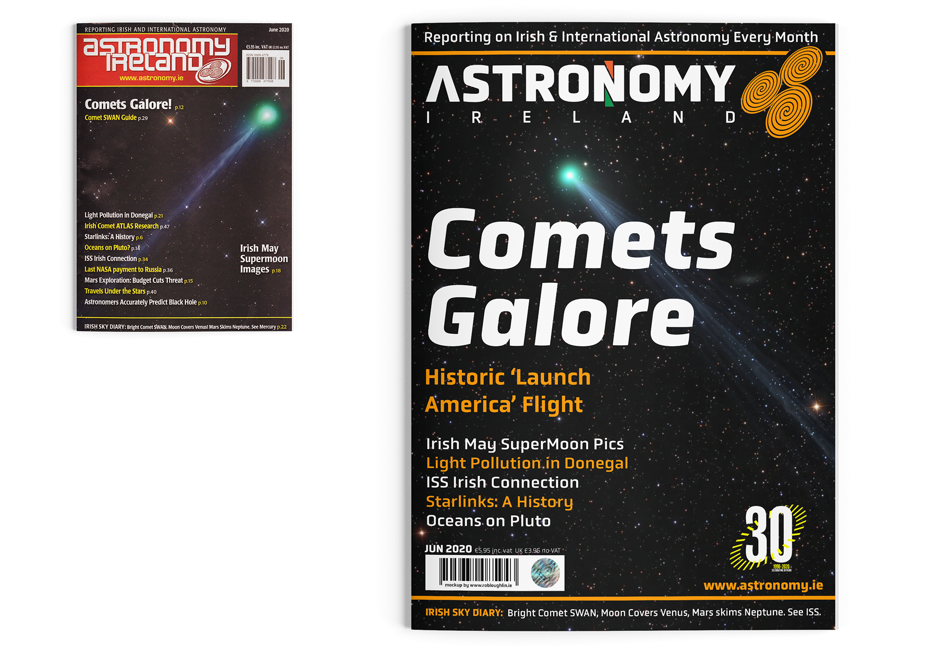
▲ The AI March 2021 issue (left) with the re-imagined design for the same issue (right).
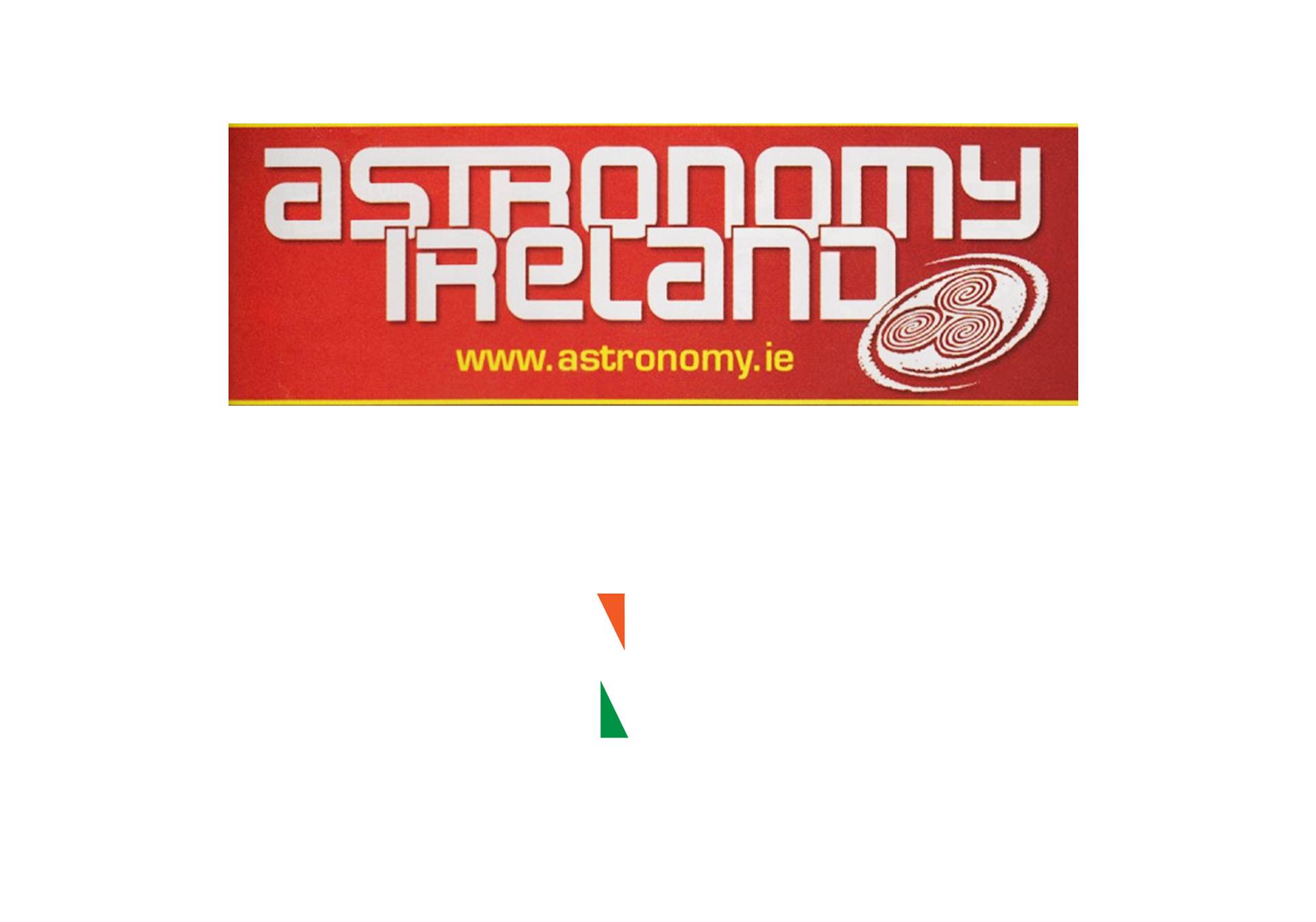
▲ The current AI logo (top) is also used as the masthead for the magazine.
The reimagined logo (below) is a refined version that interprets some of the original elements of the logo.
The reimagined logo (below) is a refined version that interprets some of the original elements of the logo.
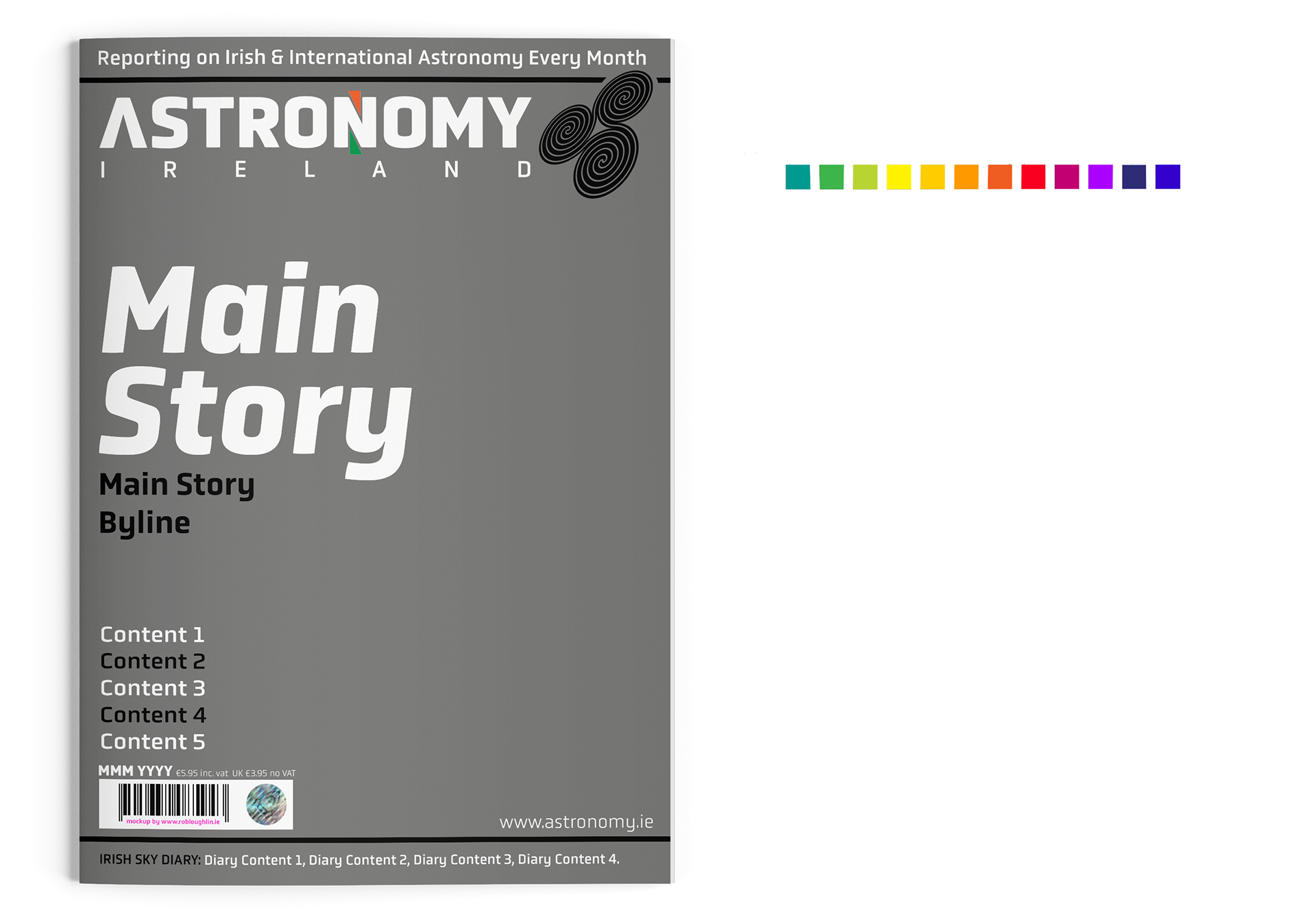
▲ The redesign of the cover, seen here as a template form, includes a new typeface for the cover, Obvia for headlines and other standout treatments, and Proxima for body copy in the magazine. Changes to the placement and simplification of the POS elements such as barcodes, pricing, date, etc. A reduction of the content headlines adds to a better impact from the full-page images. A range of colours will also be used in the magazine to emphasize each individual issue.


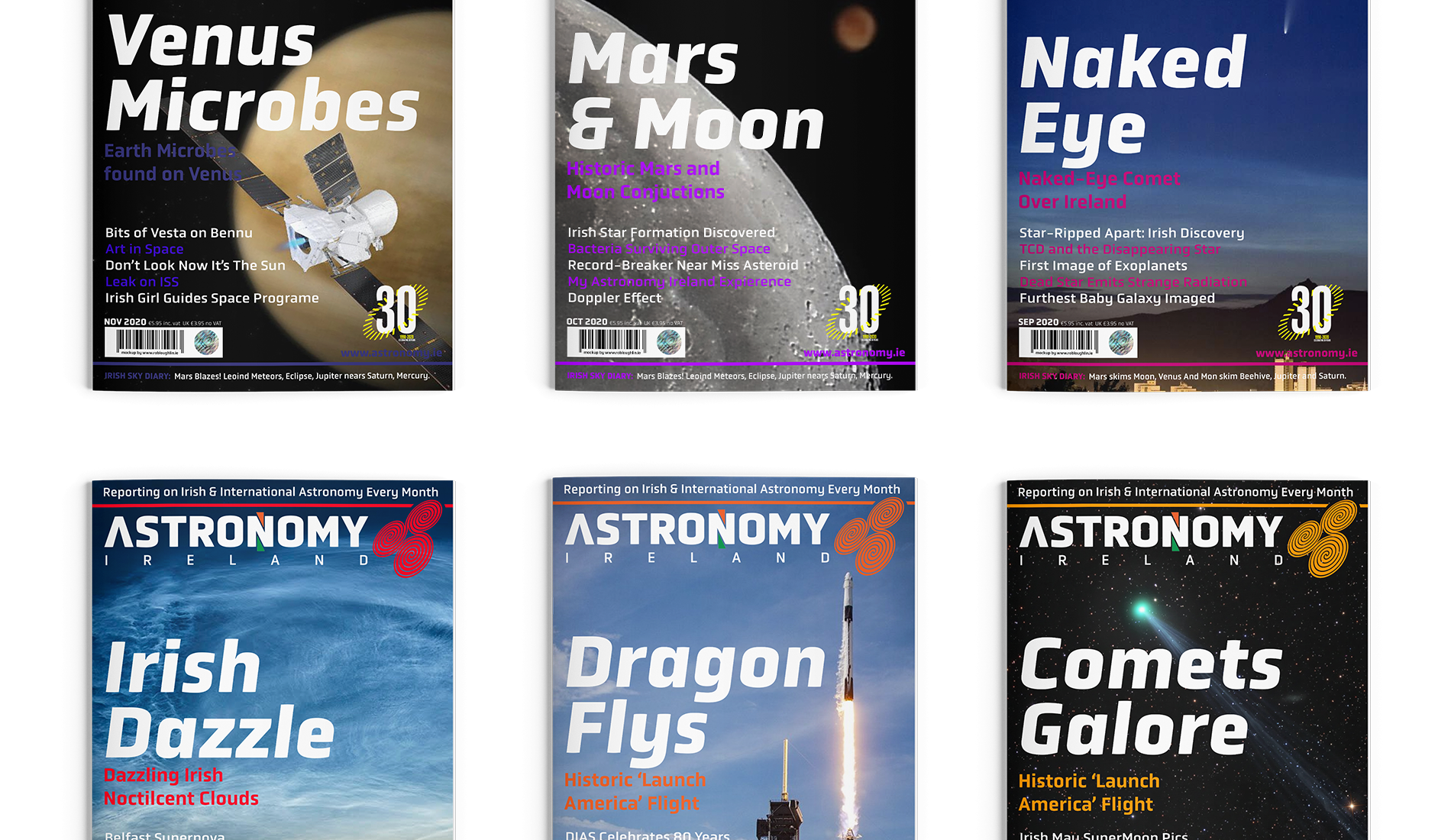

▲ Using past AI issues as a reference, the reimagined design has been applied to past covers using the same template for each issue. The same main background images were used, where available, or another image was used in place to give a greater impact on viewing.
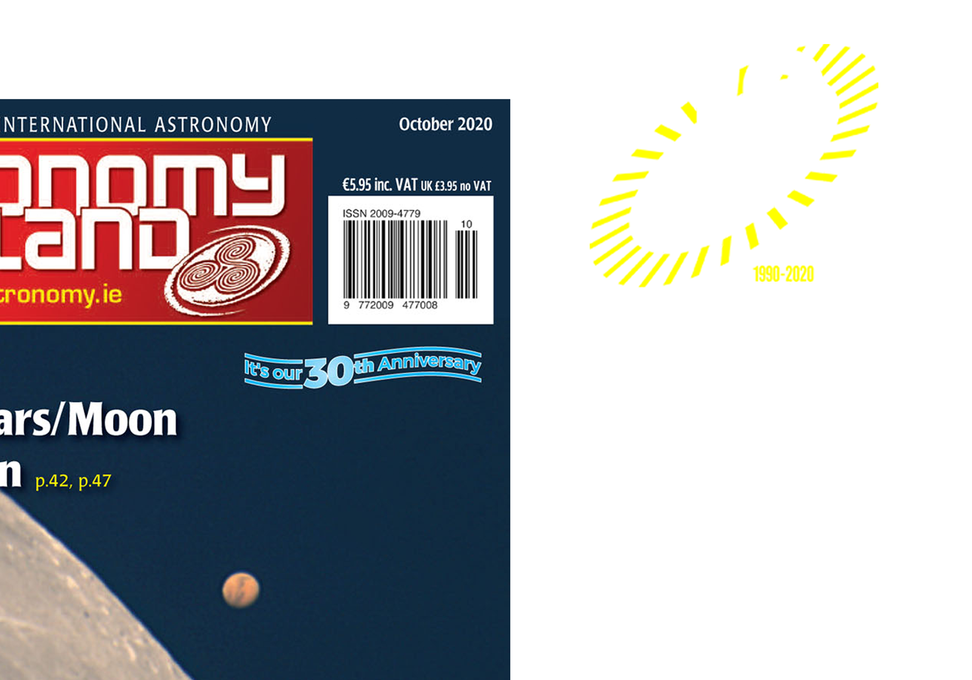
▲ With the 30th anniversary falling during 2019/20 a redesigned icon was also used to better showcase and celebrate AI's work.
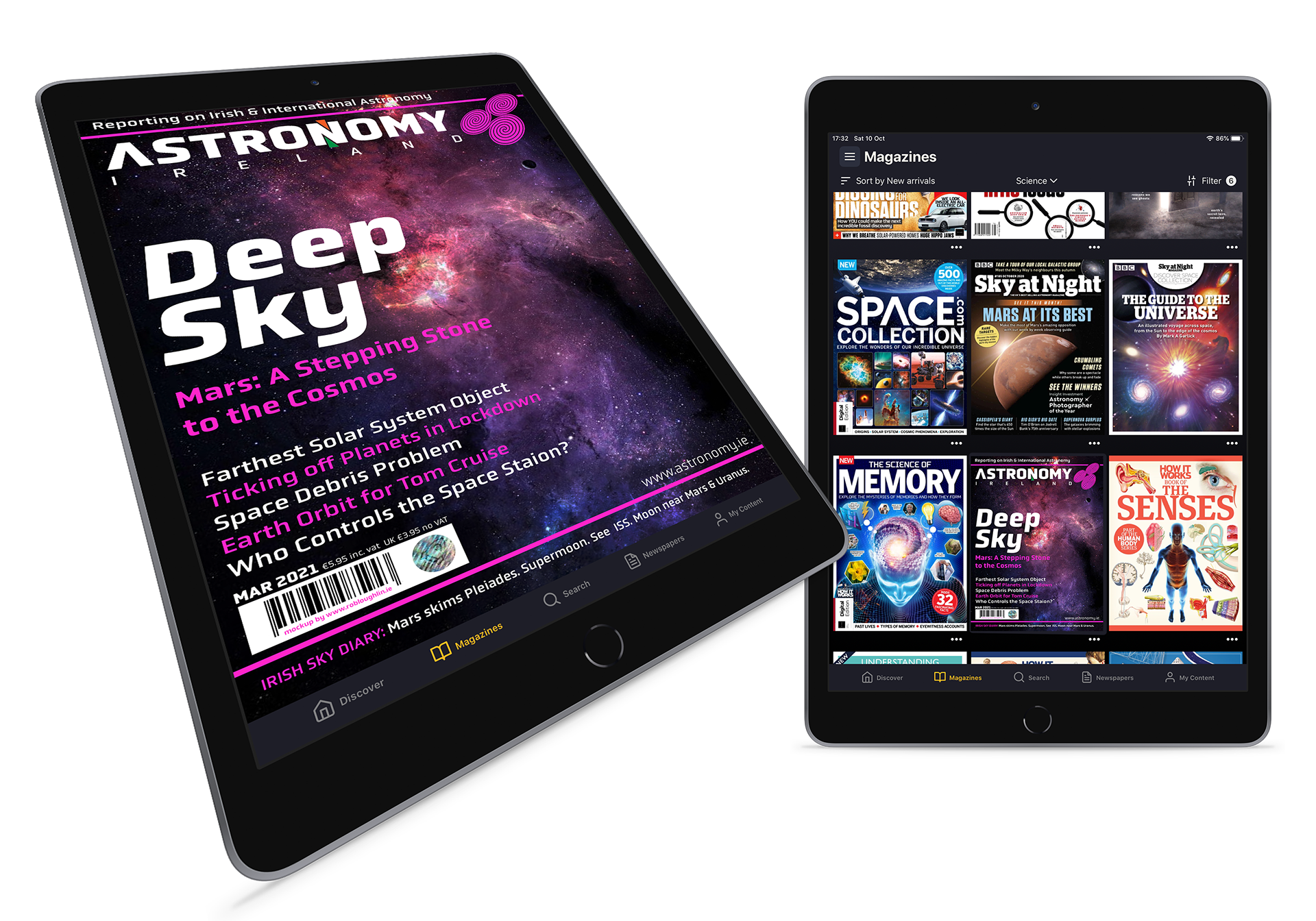
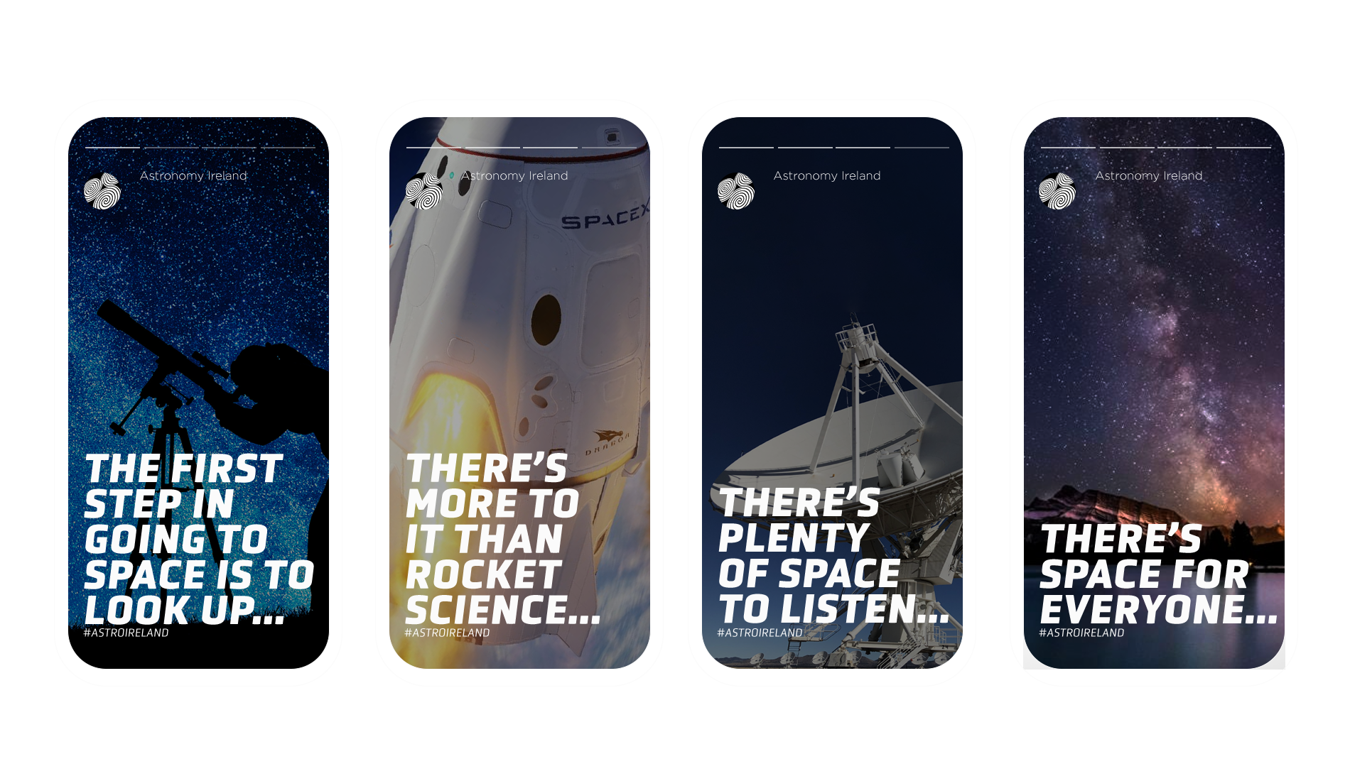
▲ The AI magazine could be made available through digital channels, as shown here with the Readly app, and how the revamped designs would 'fit in' with the other titles.
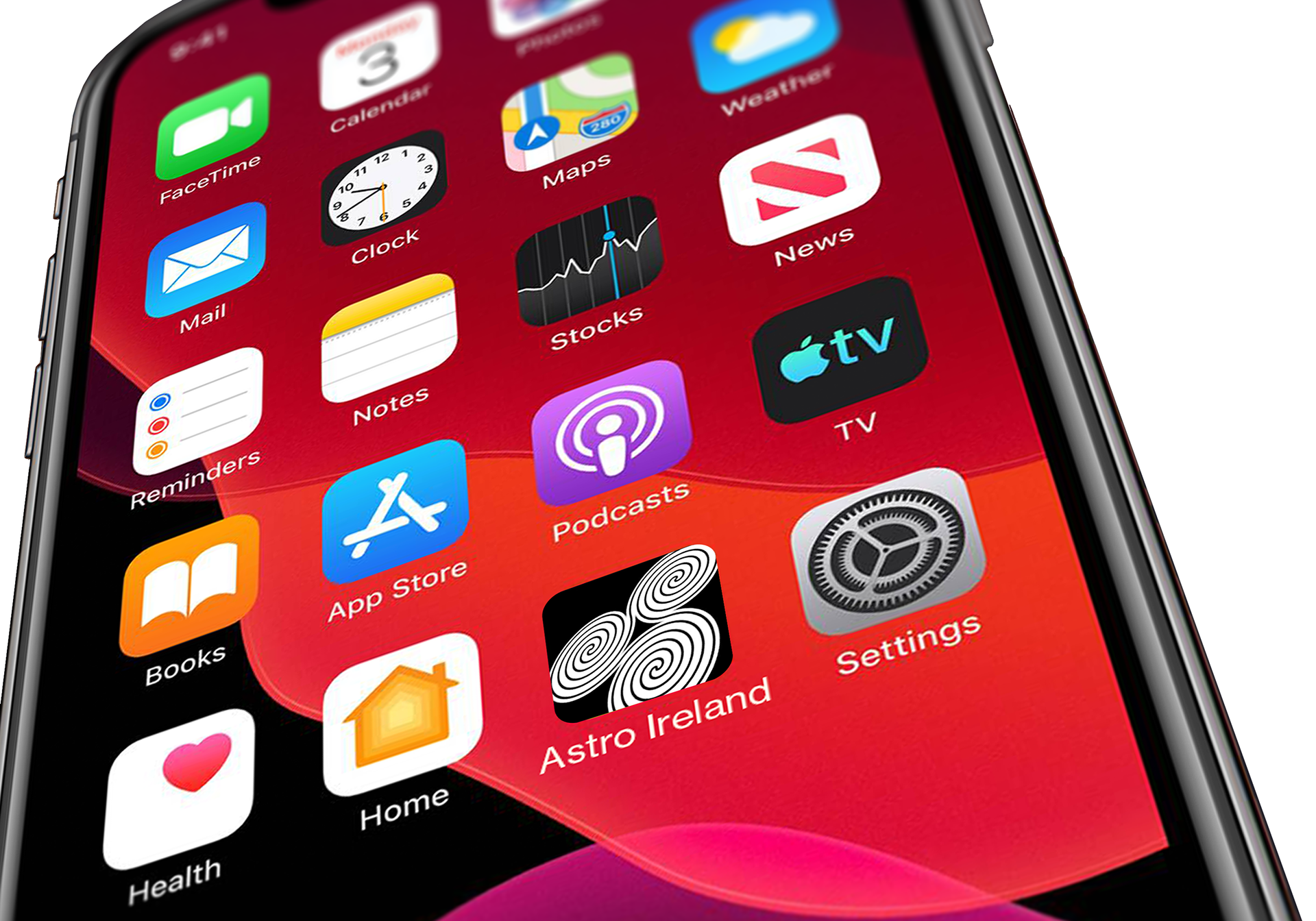
▲ With the additional digital elements, an app or home screen shortcut could be used with the 'Triskele' used as an icon/favicon.
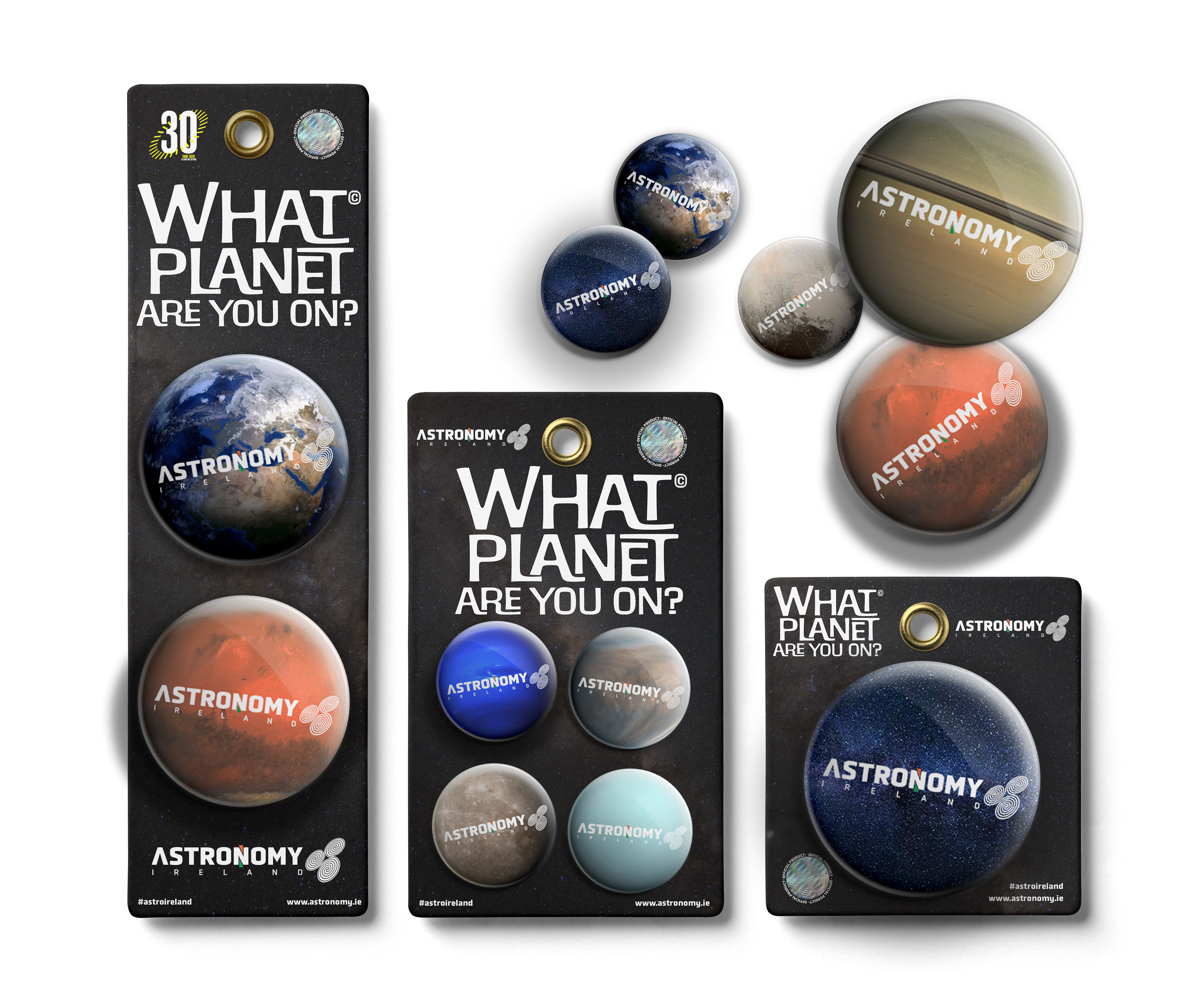
▲ As a marketing/promotion/revenue exercise, a selection of badges with the campaign of 'What Planet Are You On?' could be used to enhance and reinforce the AI branding and messaging.
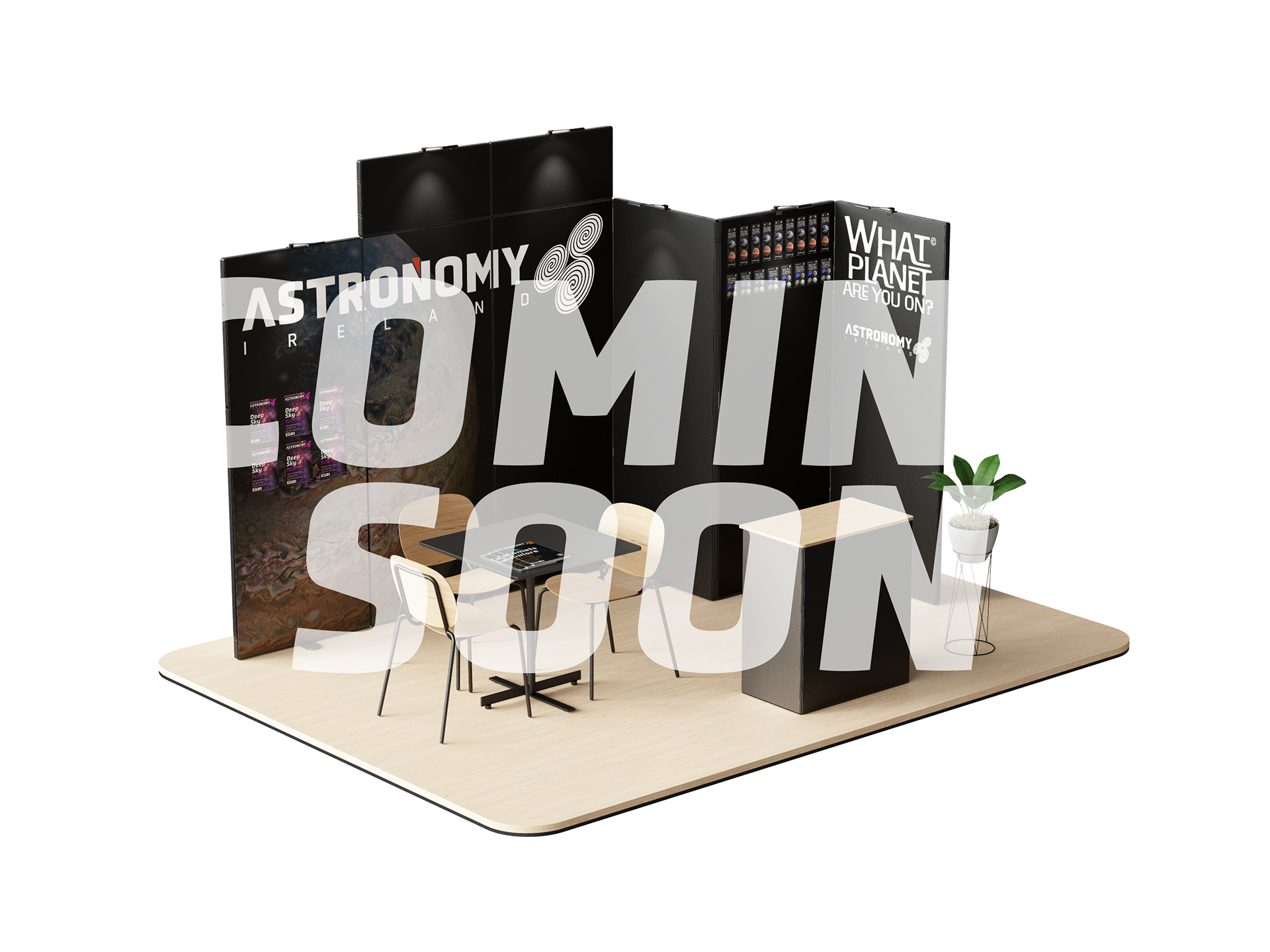
▲ For exhibitions/trade shows/educational fairs a pop-up booth can also embrace the AI branding, including the 'What Planet Are You On?' as well as an educational touchpoint on the work that AI undertake, and any membership and revenue-generating schemes could be highlighted.
▲ An example of an advertising campaign, a full wrap applied to public transport, in this case a bus, from the look achieved during daylight or strong light situations (top)and then utilising the effects of a 'glowing' or 'reflective' material (below) to allow the stars to be emphasised in low light or darkness, along with the lettering and additional CTA's.
© COPYRIGHT WWW.ROBLOUGHLIN.IE 2022